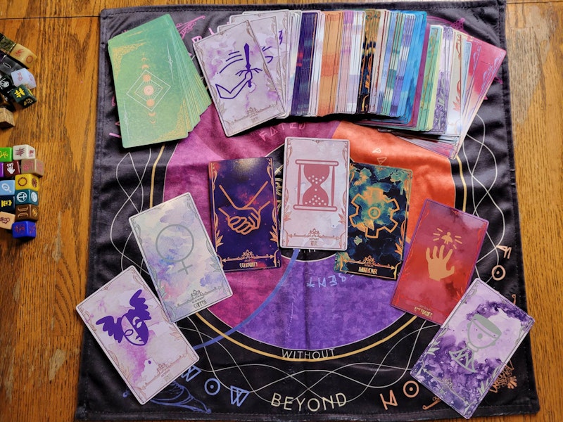
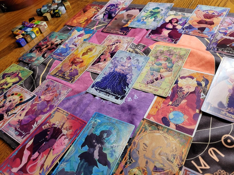
Project Update: The Dice in Hand! So! Many! Pictures!
Okay, I just threw a little fit honestly. I wrote this massive long update, all these pictures. It was an hour of writing. I scrolled down to hit Save, and it took me to a login screen. I knew immediately it just deleted everything. I don't know why the save button took me to login, or what logged me out. I'm just so so so frustrated, and re-writing this whole thing. It will probably be missing some of the thoughtful details I thought about, blah. So now at the end of my work day I'm re-writing everything I can think of. Agh. Bleh. Screm.
The Dice are In
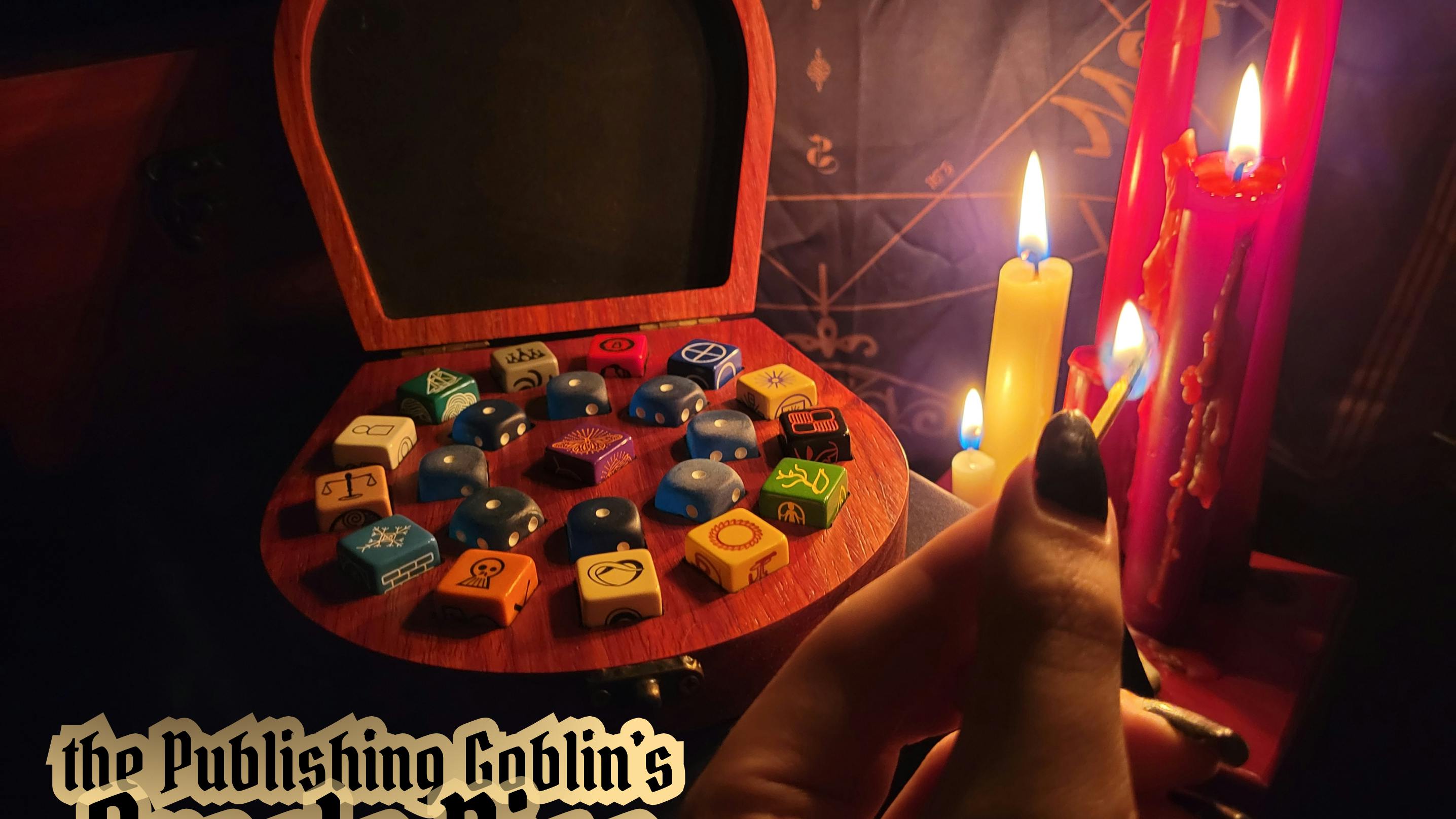
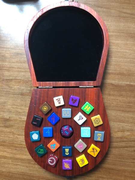
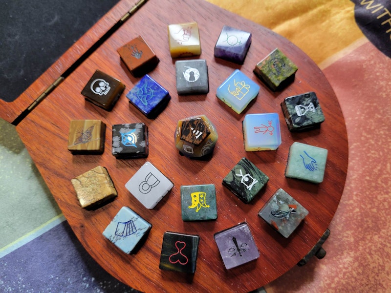
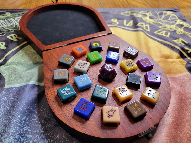
Okay, so I have the dice in hand. The long and short is this: They look amazing. They're not all correct though. Of the 22 dice, only 7 got my total okay, both in their plastic and stone form. The remaining 15 have various issues, mostly color of die or color of ink, but one had a symbol flipped/mirrored for reasons I don't know.
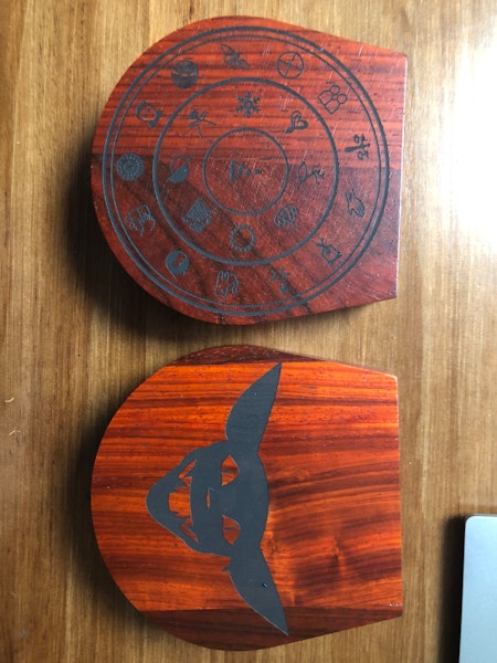
I don't have the new wooden boxes in hand, but I do have pictures from the manufacturer I'll share for now! If you are excited about anything you see here, and realize you didn't get it-- or you want to adjust your pledge in any way, such as adding, removing, or choosing new options for the wooden box (new engraving for the top), you MUST reach out to backerkit support on your survey to have them adjust it. I wish I could adjust or help you with this, but I can't!
I'm locking current unlocked orders and charging those (mostly pre-orders, some people who did surveys late) next week. So get your stuff in now! Addresses will remain unlocked until we are close enough to charge shipping costs.
Please bear in mind that the pictures don't capture everything completely the way they look in real life, and anything that was actually hard to read in real life I am adjusting with the manufacturer! : )
Additionally, only two dice, the red Obstacles Die and the 12-sided Chaos Die were made with finalized molds. The rest were all lazer etched. As we move from lazer etching to the final molds, a dozen or so dice are having small changes made to their symbols to simplify things. In almost every case, these changes were so small they're irrelevant. I almost couldn't tell on some what the changes even were. However, for the Mariner's Die and the Metamorphosis Die, some very big simplifications are being done. Simply put, I like the original designs better. However, those two were always way more detailed than everything else, so these changes might be for the best in making them match the rest of the set. (You can't see the simplification here, these dice were all lazer etched.) They also will make them actually legible on the stone dice, which right now are hard to parse with the detailed design on the textured stone surface. We are talking about potentially engraving these two dice for the whole run, I'll let you know how that shakes out.
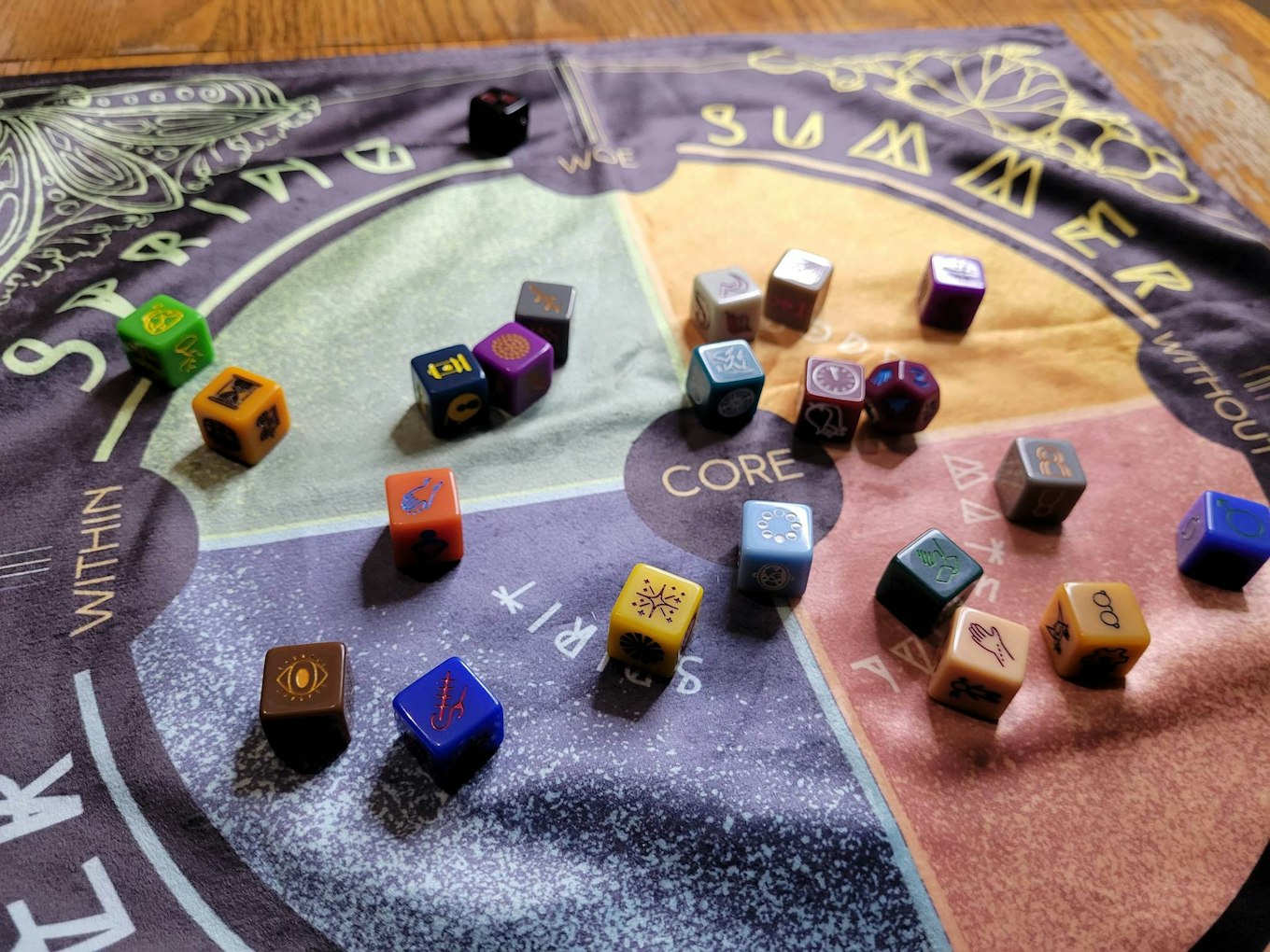
A Closer Look at What's Right, and What's Wrong
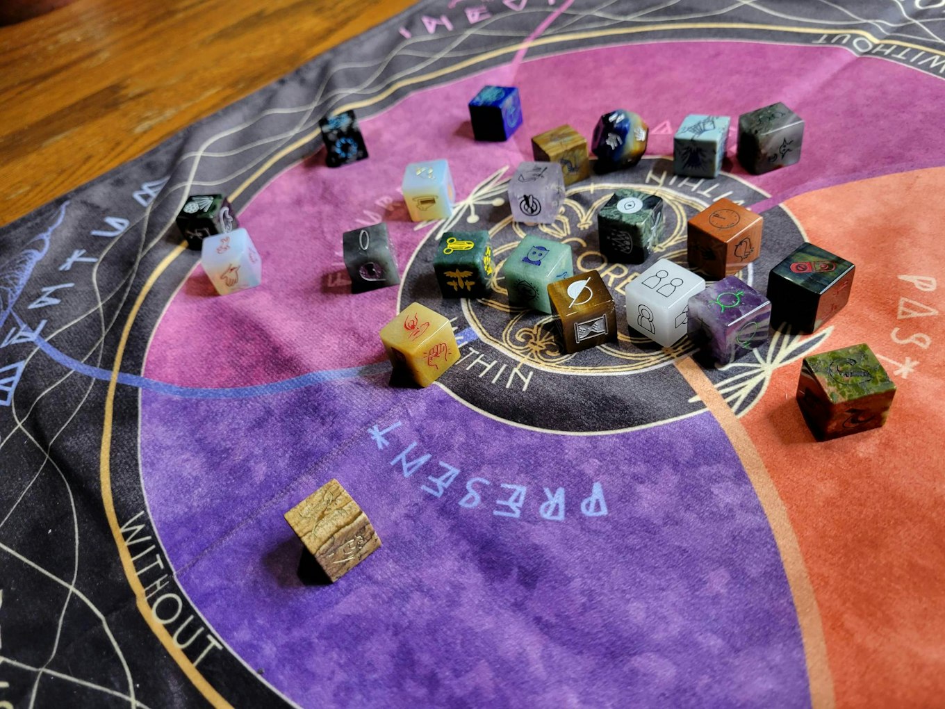
Made it to the bottom? Awesome, and welcome. Let's have a better look at the dice as a whole. This picture below features the dice set in its entirety. The original dice, the new plastic version, then the stone version. The changes I sent to New Titan to give to the dice manufacturer is below the photo, so you can see all the changes that are happening. Please remember this is a photo and in photos not everything comes out right, colors are different, some things are hard to read that aren't in real life. So trust me on the changes! : )
I think it's true that some dice are losing saturation. Some of that I'm changing, some of that I like. Also this is a different manufacturer with different clearances, so yes, all the symbols are generally shrinking in from the edges a little. In comparison directly with the first edition it is a little blah, but on their own I don't even notice.
If I do a third edition sometime down the line, I'd consider going back with the original edition's manufacturer and raising the price on the set to make that work out. But I promise, the set on its own doesn't read poorly or look less-than in person. It looks so fantastic, the mistakes aside.
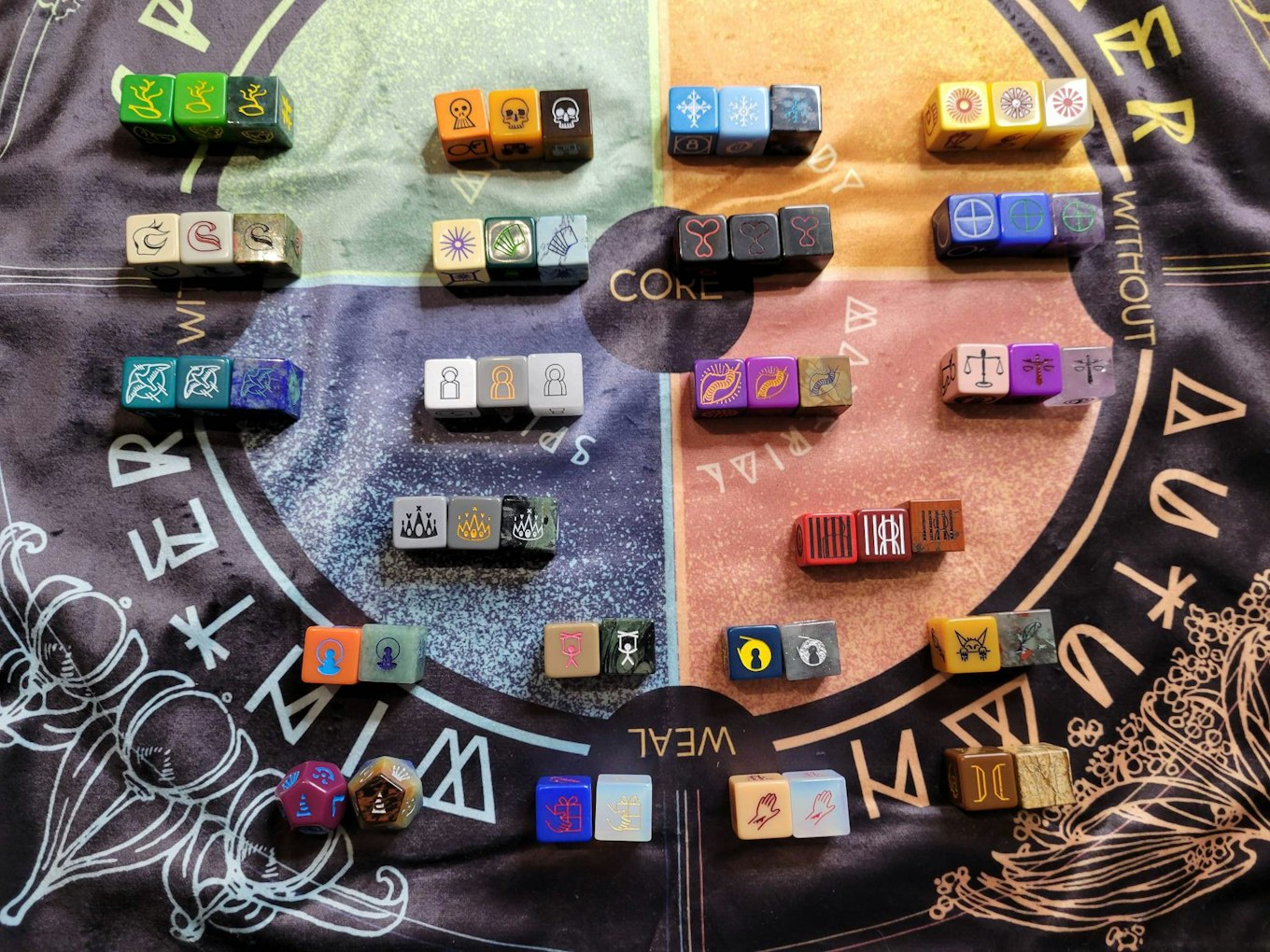
And here are all the notes I'm sending back (They cover the plastic die, then the stone die, then suggested changes from laser etching to molds). I figure that even if I say to trust me on what's changing, some people will still worry about specific things above:
- Spring Die looks good in all three forms. The stone is good. The changes they suggest on this die are okay with me.
- Autumn Die looks a little desaturated in plastic compared to the original one, makes it hard to differentiate between it and the yellow dice. I'd like it more saturated orange. Stone fits in box easily. I can't even tell what they changed in their design, so I'm okay with it.
- Winter Die looks great, I like the desaturation on it. Stone die barely fits in the box, and if I turn it certain ways it doesn't fit at all. I like their changes.
- Summer Die is super desaturated/dark, both the die and the ink used on it. I'd like it brighter yellow and the ink brighter red/orange. Stone is good. Changes look good to me.
- Elements Die looks fantastic! Stone is a little hard to read, I'd like to change to white ink for readability. Stone is otherwise good. They had no changes.
- Fate Die looks great. Stone is good. Their changes to the roulette face are okay with me.
- Majors Die has a big problem, the ink is way too dark and you can't read it at all. It needs to be a bright, bright red. The stone die looks great, and the red ink used on it is much lighter and better. Their change is okay.
- Alchemist's Die looks good. The only change I'd like to ask is if they can slightly thicken the lines, they are a bit thin. Otherwise all of it is good.
- Mariner's Die overall looks good. The stone die is really hard to read. It doesn't help that the design is shrunk, but the teal is also hard to read on sides of the die that have gold flecks in it. I think the only fix is to accept their changes, so that the lines can be thicker and more clear. All the little details are impossible to read on the stone die.
- Relations Die looks good, but I would like the die to be lighter grey than it is. Right now it's too similar to the Suits Die. Stone die looks great. They have no changes.
- Metamorphosis Die looks a little off, not quite the right purple. A little more like the original purple would be good. Otherwise the die looks good. The stone die is hard to read, which like the Mariner's Die I think would be best fixed by using their changes, so the lines can be thicker and more clear. However I don't like their changes for the normal die, but I think their changes make the die look more like the other dice, which is okay. So let's accept their changes.
- Actions Die the ink is totally the wrong color, which makes it impossible to read. Ink should be bright pink, not this dark red. The Stone Die looks fantastic. They have no changes.
- Suits Die I would like the die grey to be darker. Right now it looks exactly like the Relations die, even though they're slightly different. So darker grey. The stone die looks amazing. Their change looks okay to me.
- Obstacles Die looks so amazing, both the plastic and the stone. I don't like that the design on the stone die is so much smaller. You can see a huge difference on the face in my picture with the bars. However it looks great. They have no changes.
- Longings Die looks good. Stone too. They have no changes suggested.
- Influences Die is totally the wrong color. It's supposed to be a nice deep blue, this is some kind of tan or beige. Kind of caramel colored. The pink ink looks like the color I wanted on the Actions die (please let them know this pink should be used on the Actions Die), but this pink is way too neon, it's supposed to be soft baby pink. The stone looks good. They have no changes suggested.
- Attentions Die is totally good. No changes suggested either.
- Goblin Die the yellow looks good, but the black ink they used was supposed to be dark green. On the Stone Die, let's use gold ink on the it instead of black, it's too hard to read. The changes are okay with me.
- Chaos Die it's almost perfect, but there's a big issue. The main face on it, the triangle with the 's' in it-- they flipped it. I know you said this is one they made a mold for, but they did it wrong. This is the correct symbol below, and you can see in the image I sent that the S is backwards. I checked all the other symbols on all the dice, nothing else has been flipped. Everything else, the colors, the stone die, it all looks good. I don't see any other suggested changes.
- The Kindness Die is the wrong colors. It should be a bright, almost neon baby blue, not this deep almost purple blue. The ink looks okay. The stone die looks amazing. It doesn't look readable in photos, but in real life it looks great. They have no suggested changes, so we're good.
- The Wounds Die is good. The ink is a little darker than I thought it would be, but it works. The stone is good. They had no changes.
- The Alley Die is good. The stone die is too hard to read. I don't know what color would work well, I'm open to suggestions from them, if they want to try a different color and send a picture. They had no suggested changes.
And a note on the stone dice... The plastic dice are molded, they are exact. Perfect. The stone dice are carved, they are not exact. Some of the stone dice were snug in the wooden box holes. Some of them had issues where they didn't fit in the holes at all unless I turned it to a different face, because the stone isn't perfectly square. None of them were WAY big or anything, they were just slightly too large when turned certain ways. The only issue this brings is that if you get the symbol engraved top for your wooden box, and then it turns out that stone die can't fit in the right way to get that face upright... I'm asking if we can ensure the dice will be as close to size as possible, but it may just be a trait of the stone dice. Bear that in mind, their more organic form just isn't absolutely exact, and can lead to snug fits.
And that's everything! Fulfillment...
We're about 2 weeks behind on our planned schedule, so I wouldn't be surprised if we end up shipping into and through March, rather than February, but I think I basically said Feb/March last time. New Titan thinks we'll be good for February but I know better than to trust the state of the world right now. I'll of course let you all know as things change, if they change, etc.
Right now I'm exhausted. All the final fixes and details for all three projects have gotten bigger than they were, and while I should have everything finished up shortly, I'm tired. There's a fourth overlapping project in the background I wasn't supposed to have a hand in, but something got messed up horribly back in June or July and I've been working on that simultaneously ever since. As a result, I'm taking a break once my work on these three overlapping projects is done by the end of next week, and just focusing on making sure the Alleyway Oracles are ready to go in mid April, when all 3 of the current projects are finished and in people's hands. And after that, I'm likely not doing any other projects in 2023. Okay, maybe one in October.
Year of the Goblin will get prepped in full for 2024. No 'small detail that becomes a big detail' will be left to be done for later. The only projects that will go live will be projects fully ready to go, every print file finished and okay'd with printers/manufacturers, etc. If 12 projects aren't ready for that, then only the ones ready will run. Period. The little details I have to chase down at the end of each project are never as little as they seem!
I'll continue to pass on news as I get it. Thank you,
7DA
your pub gob
Comments
10
