Previously backed this creator's crowdfunding project
This user contributed to this community!
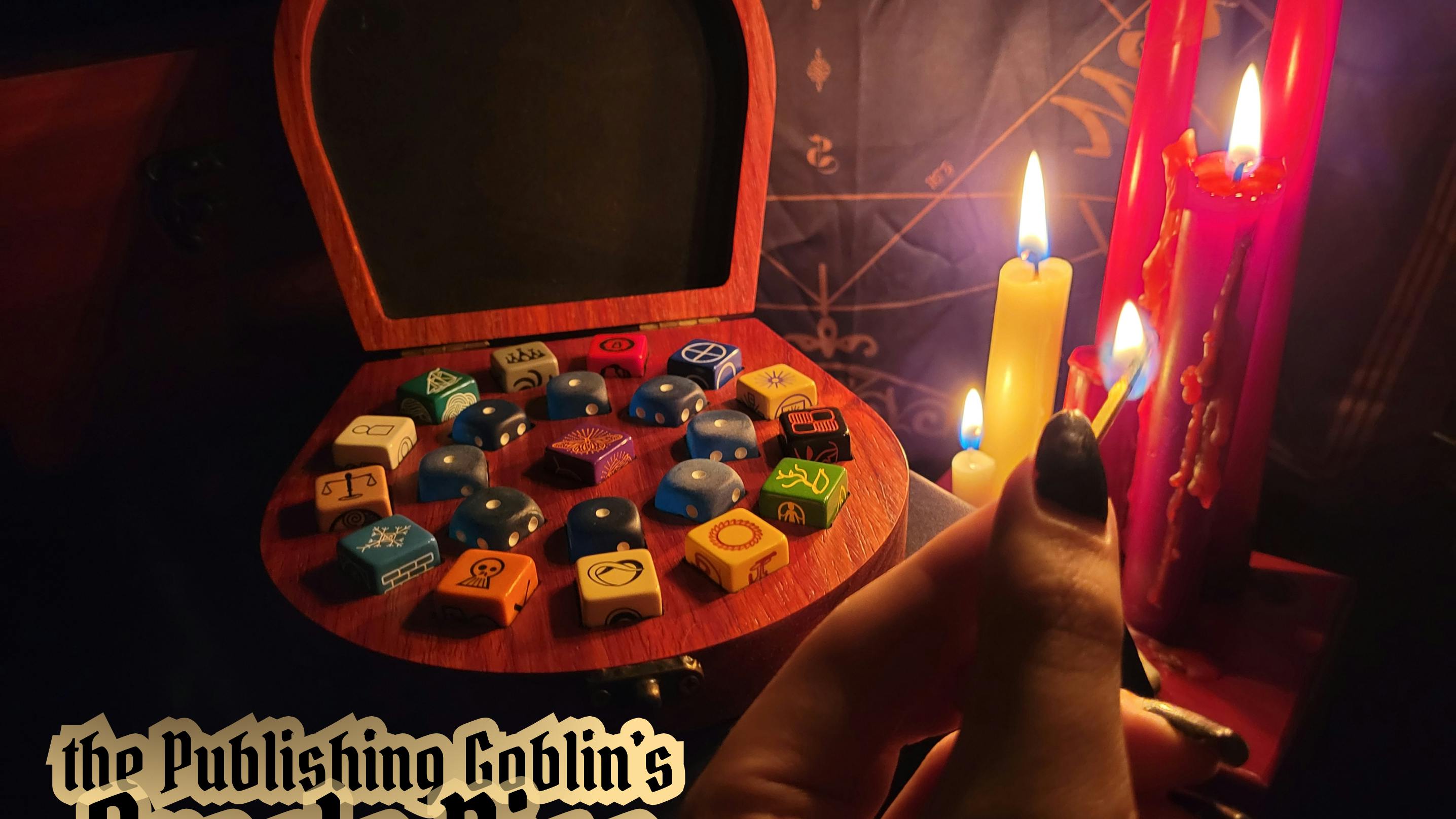
Just got my stuff today. I got everything ordered. Everything looks great so far. Cards were nicely printed. The table of contents doesn't know what it wants to be:) My only small issue is that the color contrast of orange and purple on the Action Die and Metamorphosis Die is really hard to read in low light. The Blue and Green of the Alchemist Die is ok-ish. The embossing on the Metamorphosis Die didn't really leave a good impression, the faces are almost unreadable. The sample pictures of that die had more color contrast and better definition of the faces. That's really my only quibble. Great project!!
