Matteo here for the second episode of the Design Diaries! Today we'll explore how the game models global warming and its impacts, with a focus on how we designed the game board, crisis cards and planetary tipping points.
Where does one even start making a climate game?
After Matt and I agreed on the type of game we wanted (see our design goals) we stood in front of a potentially overwhelming next step: where does one even start making a game about “solving” such a wicked problem as climate change?
It made sense to start by defining and modelling the problem that players would try to solve. The science of global warming is solid, so we could begin by translating that into a simplified, playable model. Once set in motion, and without any “solving” done, that model would loop into worse and worse conditions, and eventually cause a loss for everyone.
At first we didn’t quite know how it would work, but we could imagine a non-linear growth of emissions, which players would experience viscerally as tokens piling up on the board, triggering all sorts of disasters.
Modelling the carbon cycle
We learned that the world emits around 50 billion tonnes of greenhouse gases each year. Roughly half of those emissions are absorbed by our planet through natural sinks like forests, soil, and oceans. The remaining net emissions accumulate in the atmosphere, and drive up global temperatures. The increased temperature, in turn, causes planetary effects, such as the loss of natural sinks like the Amazon rainforest (meaning less emissions are absorbed) or the melting of ice caps (meaning more heat is trapped).
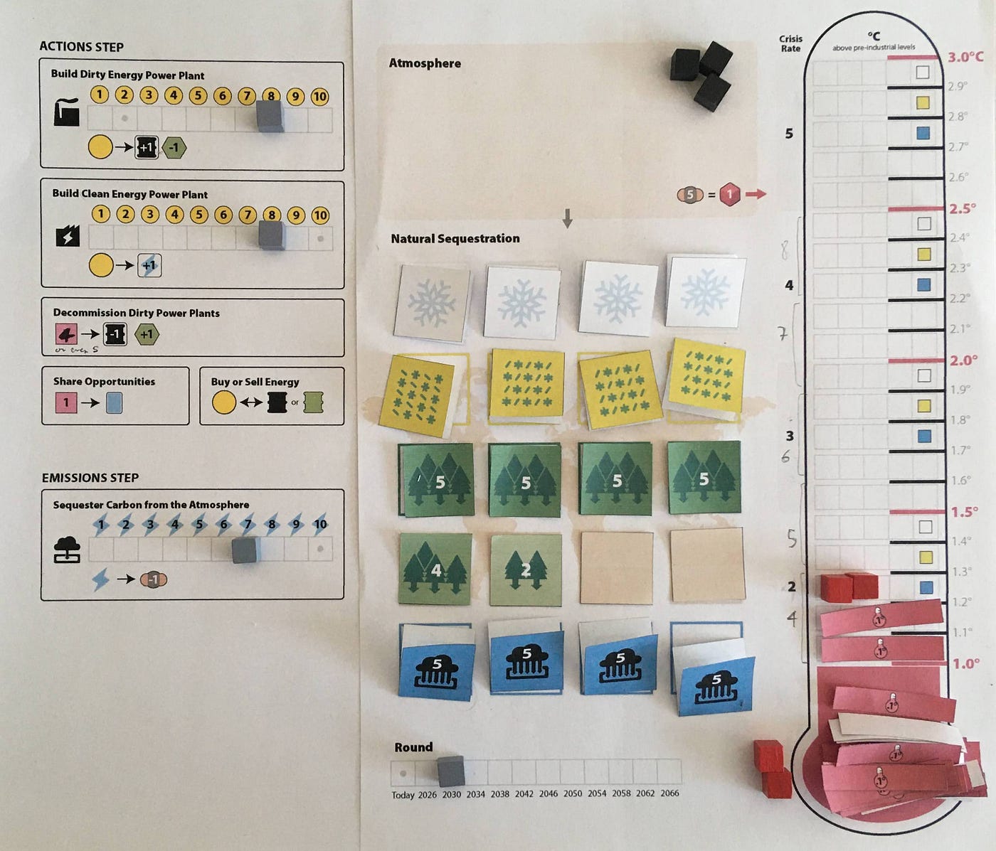
This game board from June 2020 exemplifies our early attempts at creating a playable model of the emissions cycle. At the top is the Atmosphere, where all players dumped their emission tokens each round. From there, an arrow pointed down to Natural Sequestration, where green squares with trees represent land sinks and blue squares represent ocean sinks.
Players would put these tokens on top of the world map to track the state of natural sequestration. There would be a starting amount of sequestration (related to the current state of natural sinks) and the possibility for actions like “reforestation” to increase that amount.
On the world map we also represented some planetary effects: white squares are ice caps, lime squares are permafrost areas, and sand squares are desertification areas. These would be covered with double-sided tokens, at first all face-down.
From the Atmosphere, another arrow points to a giant thermometer, where emission tokens are converted into red temperature cubes. As the thermometer fills up, it will trigger the random flip of planetary effect tokens on the world map.
For instance flipping any of these lime tokens (melting permafrost) would release extra emissions to the atmosphere. We originally represented emissions as carbon dioxide (the most common greenhouse gas): one atom of carbon and two of oxygen.
Setting expectations
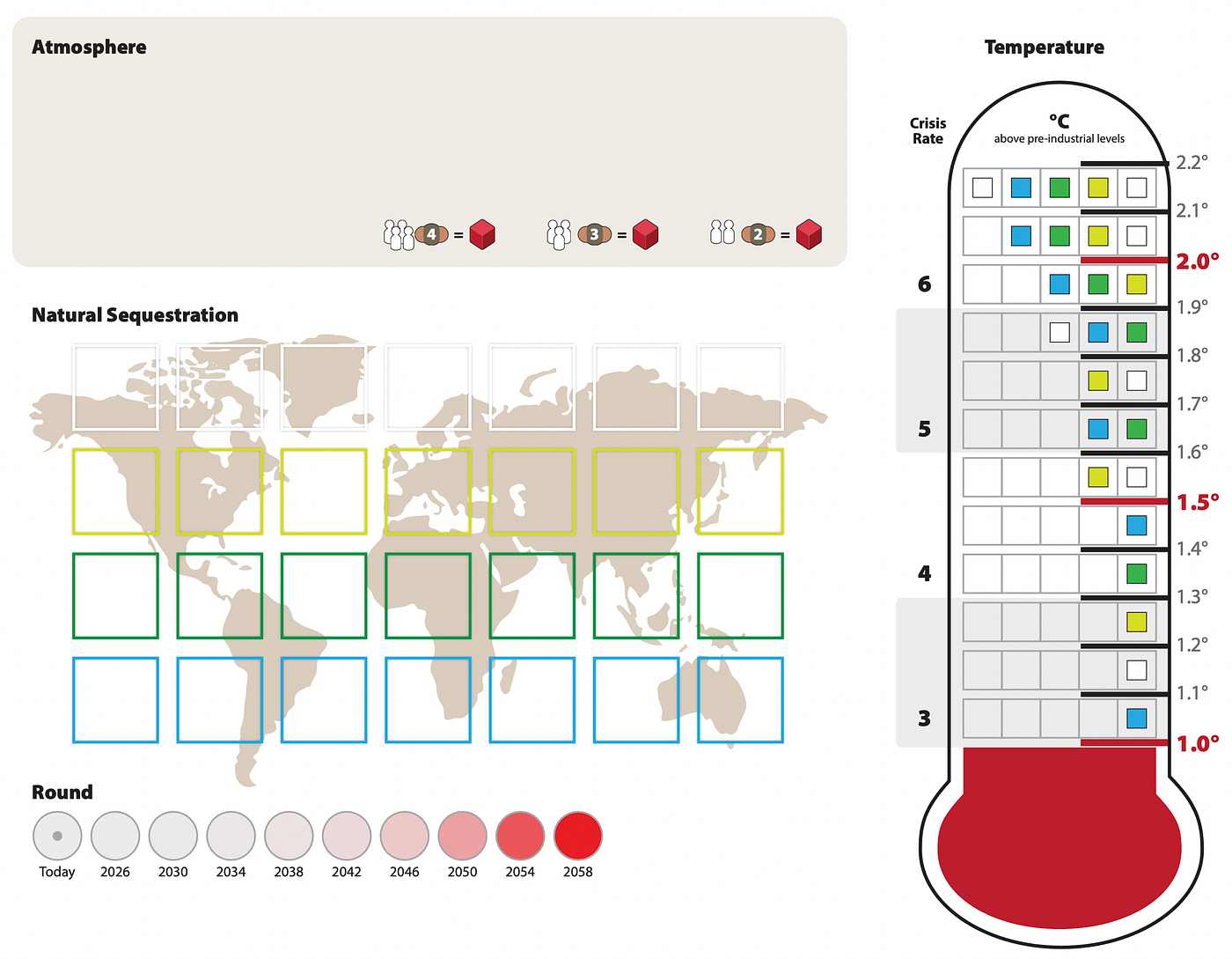
Notice how the thermometer goes up to 3.0ºC in our early board. We quickly learned that was too lenient, and the runaway loop of climate breakdown too gentle and unrealistic. So we chopped the thermometer to about 2.0ºC and intensified the growth of planetary effects to be flipped.
For a long time we resisted setting game-over conditions at specific points of the thermometer or of the round track. We were (and still are) convinced that when the game ends in a loss, it shouldn’t be due to an arbitrary number, because the world won’t end in 2050 or if global warming reaches 2.0ºC. Therefore, a loss should happen if players lose control of the system, when its conditions have become unbearable.
However, we observed that the lengths of both thermometer and round tracker would set strong expectations, and often false ones. “We have 10 rounds to fix this” was a comment we often heard from playtesters at the beginning of games that would end after 3–4 rounds. While some players felt relaxed about their time and temperature allowances, others were concerned about how long the whole game might take.
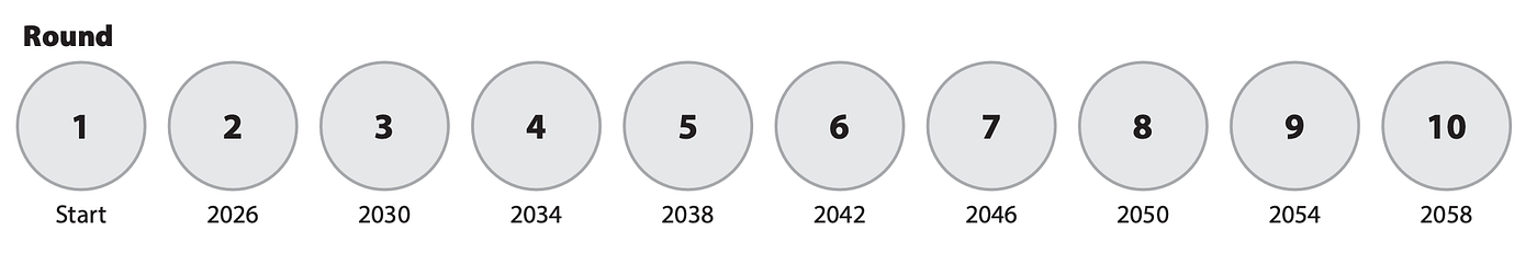
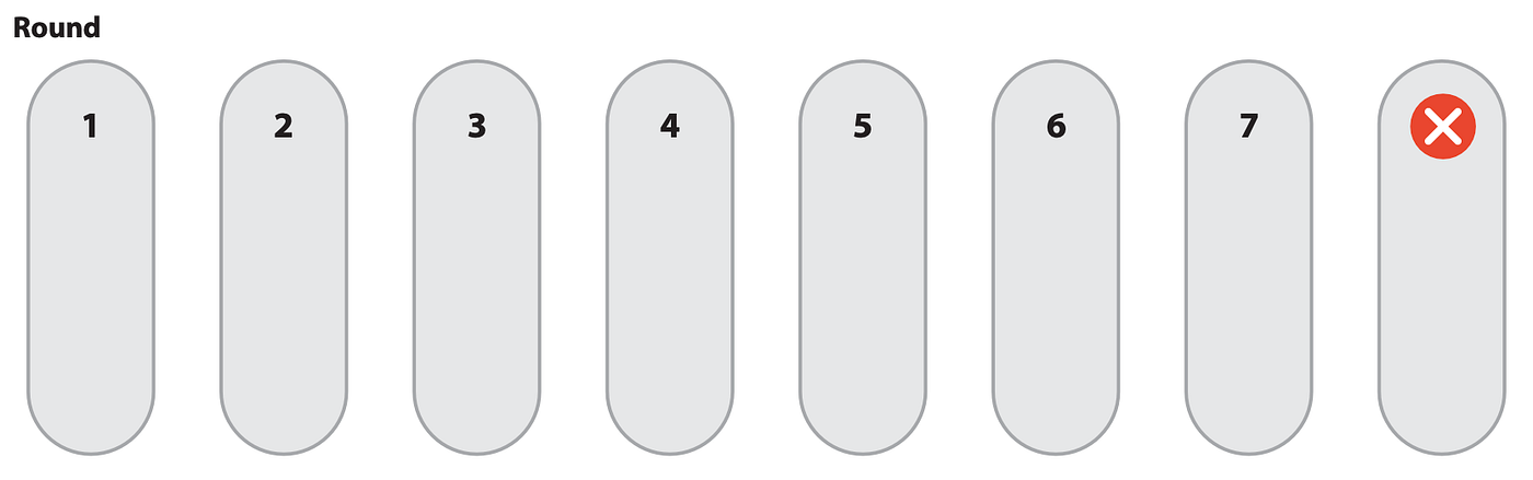
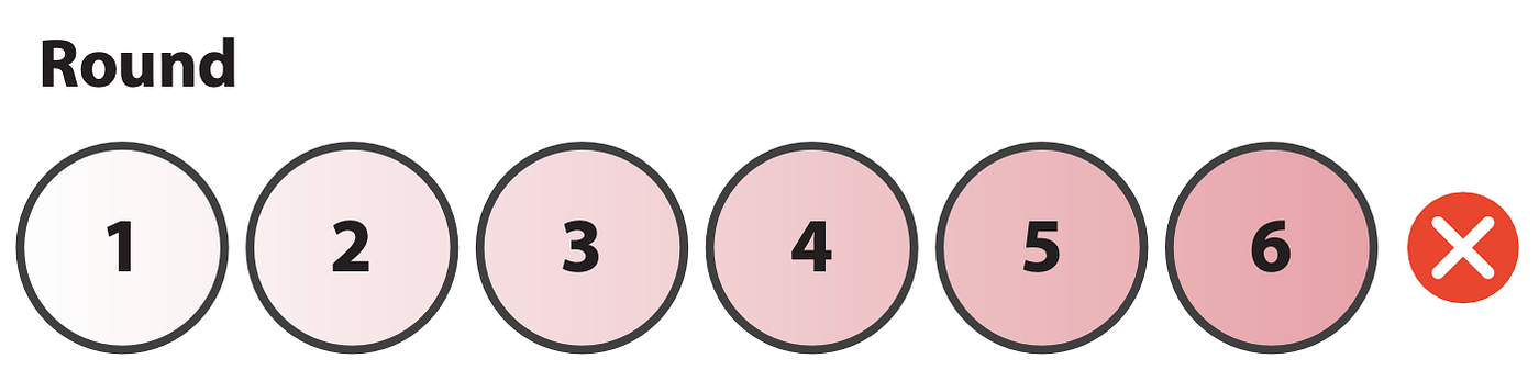
We needed to adjust players’ expectations, and instil a sense of urgency. We also wanted to communicate that the higher the temperature, the more future generations will suffer. So we chopped the round tracker and thermometer even further and defined two hard-stop points: if the temperature ever exceeds 2.0ºC, or if players haven’t won by the end of the sixth round.
Another question we grappled with was how to link game-time with real-world time. At first we imagined each round would represent 4 years, the first one being set to Today. But what would happen when people play this game in a few years, and Today is the date of the second or third round?
We gradually removed any reference to years from the game board, but I still like to tell players that each round is about 5 years in real-life, so you have about 30 years from now to stop climate change! It seems to help them tell a better (more grounded and vivid) story of their game.
Divisions and delays
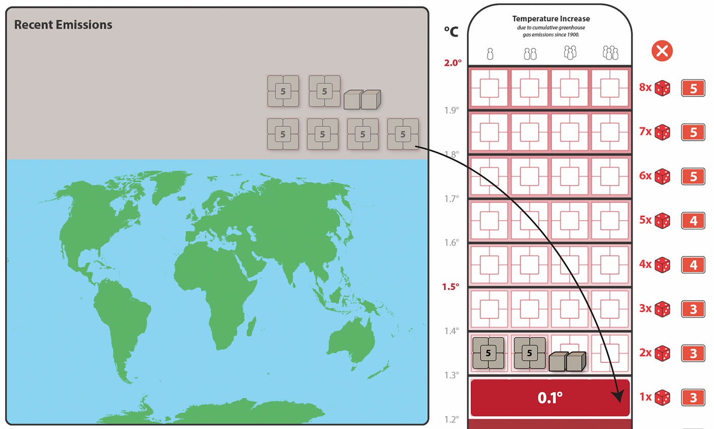
Playable does not automatically mean fun, especially if there is maths involved. This became particularly evident in the procedural step when players convert emission tokens into temperature cubes. It’s a relatively simple operation, like 34 (emission tokens) divided by 3 (players) equals 11 (temperature cubes), but it’s definitely not fun and it’s error prone.
On top of that, a direct conversion between emissions and temperature was scientifically a BIG flaw, as our advisor Pablo Suarez from the Red Cross Red Crescent Climate Centre pointed out after a playtest. Our prototype didn’t model the real-world delays between emissions and temperature changes. As Pablo explained:
The change in temperatures is not determined by current emissions but by current concentrations, which result from past, cumulative emissions. More or less emissions during this decade will have a near-negligible impact on temperatures this decade. Even if we magically stopped all emissions tomorrow, there would still be about the same change in real-world global average temperature by 2030.
We didn’t want to include extra steps to simulate delays, because the added scientific accuracy would only make the game slower and increase the room for errors. Instead, this gave us the opportunity to fix the emissions→temperature conversion problem too, by removing that conversion step altogether.
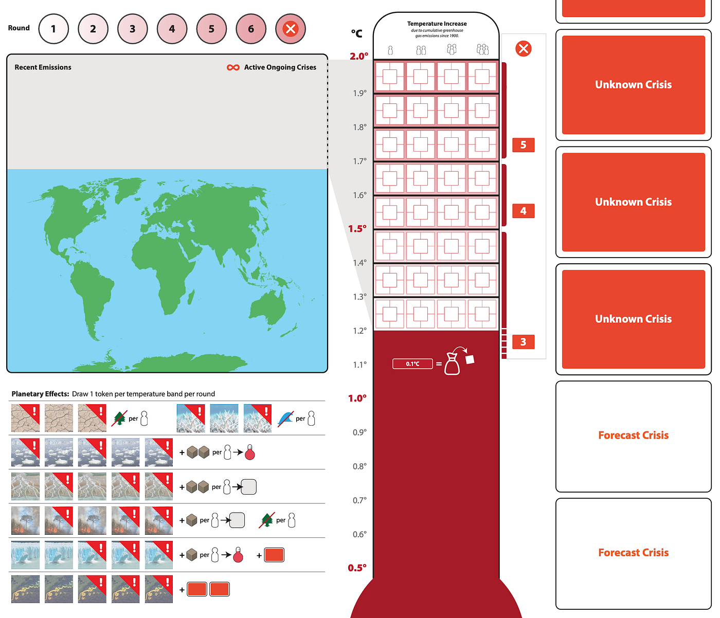
Emission tokens are now added directly to the thermometer to demonstrate the rising concentration of greenhouse gases in addition to rising global temperatures. When emission tokens fill up a row in the thermometer, a 0.1ºC of global warming gets locked in, as a red temperature band.
Impacts on the planetary system
All this modelling of the carbon cycle would remain rather abstract, if it didn’t lead to consequences for players. These will be felt in two different ways: first the impacts on the planetary system via planetary effects, and then the impacts on people via crisis cards (more on those below).
For several months we represented planetary effects as random flips of tokens. Those would be sitting on top of the world map in contextual locations (the ice caps over the poles, etc.) while their triggers would be embedded in the thermometer. This turned out to be quite inflexible. First, the size of the tokens restricted the amount of information and effects that we could put on them. And their triggers were not only cluttering the thermometer, but also making the impacts predictable. For example, you always knew that at 1.2ºC of warming you’d lose a tree sequestration token.
When we redesigned the thermometer to fill up with emission tokens and temperature bands, we took the opportunity to reskin and expand the planetary effects as mini cards.
This allowed us to give more flavour and detail to existing effects like “lose a tree” and introduce new effects that would increase the uncertainty of the post-emissions phase, with Tipping Points mixed in for extra cascading potential.
Thermometer v2.44 (left) and sample planetary effect cards (right)
We sliced the thermometer into three sections, so that the higher the temperature, the more planetary effect cards for players to draw each round. After a virtual playtest with Jon Perry and Wolfgang Warsch, we modified the rules so that you draw a number of cards equal to the number of temperature bands.
This made every 0.1ºC really matter. But it also doubled the number of cards you’d draw, so that it started to feel “tedious to flip that many cards, especially late in the game” as our publishers Alex Hague and Justin Vickers reported. Could we compress the planetary effects phase into a more tense and powerful experience, while possibly keeping the elegance of “one draw per temperature band”? In other words, could we have fewer card draws, with each card being more powerful, but also keep the same number of card draws to make every temperature band matter? Clearly not. But we might still achieve both goals if we used a different system than cards.
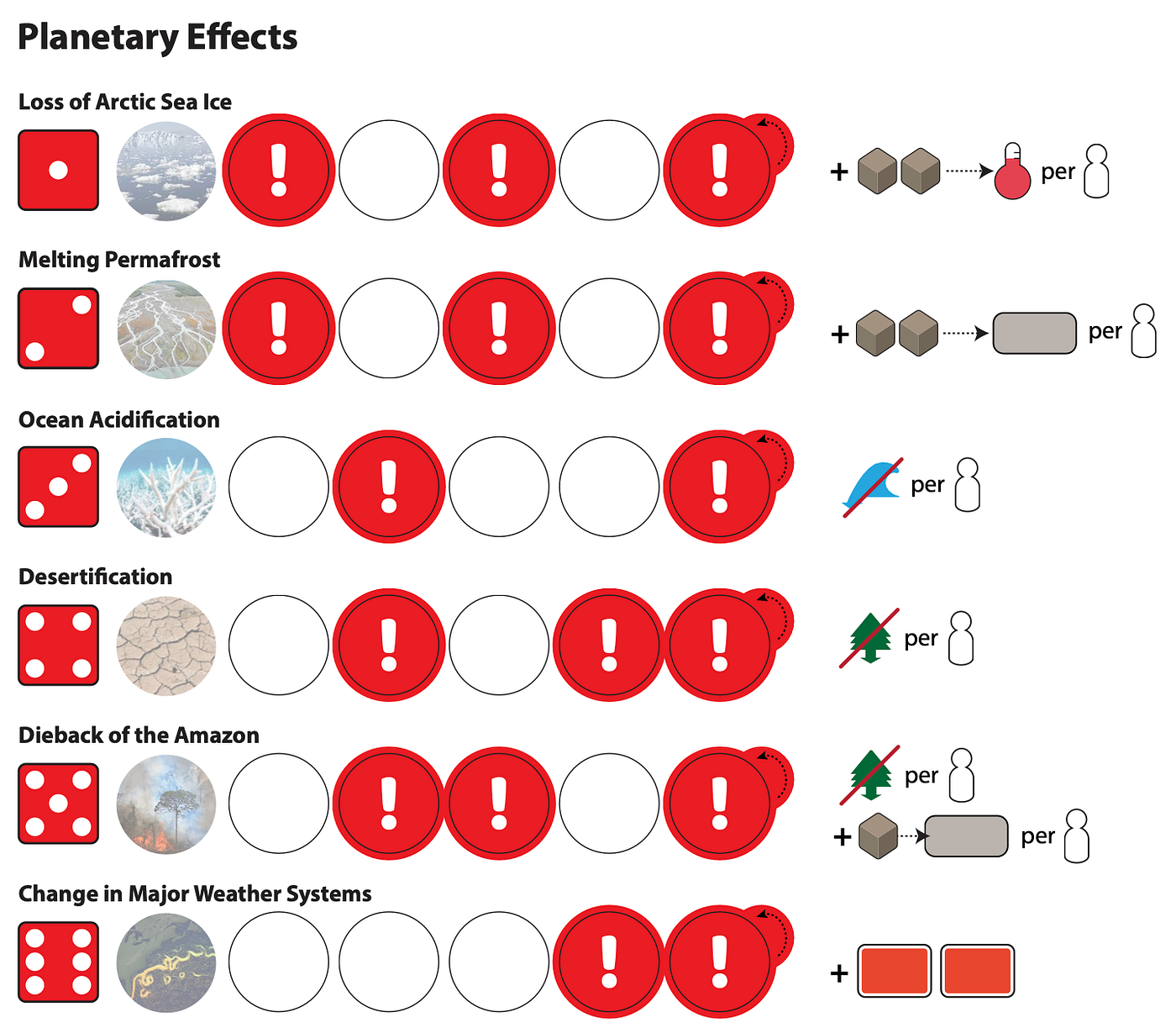
If we made each planetary effect more powerful, we should also let players see them coming, otherwise they would feel unfair and arbitrary. This means we should render the build-up of each effect more visible/predictable, but keep the exact moment when it triggers uncertain. Visualising the build-up of effects pointed towards tracks, and their uncertain triggers suggested some randomised draw. But instead of drawing cards, players draw tokens from a bag. They add them to their corresponding tracks, and only when a token lands on a “tipping point” the effect triggers.
With this system we were able to maintain the “one draw per temperature band” rule, and at the same time increase the tension players felt, as they could see the planetary effect tokens building up towards tipping points, but they were never sure when they would detonate.
It worked a treat, but our sustainability advisor Ruth Meza then informed us that the cloth bag from which players draw all those tokens would add a significant carbon footprint to the game.
“What about using dice instead?” suggested Alex. So we started experimenting with a D6, on which each side is mapped to a planetary effect. Players roll once per temperature band, and advance the corresponding token on its track. When a token lands on a “tipping point” the planetary effect triggers.
It turns out this maintains the mounting tension of the “tokens from the bag” system, with the extra drama that die rolls bring. The dice also resonated with our advisors as a good metaphor for the uncertainty associated with these planetary systems. And we use fewer, more sustainable components.
Impacts on people
While planetary effects make life harder for players, but don’t inflict direct damage, we also needed to model the direct impacts of global warming on people.
Crises span from extreme weather events like storms or heatwaves that cripple communities and infrastructure, to shocks like crop failures which can lead to recessions and famines. In a broader sense, a crisis can be any major event or force that gets in the way of climate progress, like an international treaty that blocks a clean energy transition, or pretty much anything the fossil fuel industry does (from their core business to the disinformation they fund), as Bill McKibben reminded us on a memorable post-COP26 videocall.
Thermometer v1.10 (left) and early crisis card prototype (right)
Back to our early game board. On the left side of the thermometer, notice a scale from 3 to 6. That is the Crisis Rate: the higher the temperature, the more crisis cards players will resolve at the end of each round.
The “Sea Level Rise” crisis card is an early experiment in linking temperature to damage, which then became a standard pattern for crises. Not only does a higher temperature trigger a higher number of crises, but each of those crises will cause more damage. So at 1.2ºC you’d have 3 relatively harmless crises, but at 1.6ºC you’d have 5 of them, and each would be three times more damaging.
The double escalation of both crisis quantity and severity allowed us to simulate the non-linear dynamics of climate breakdown, and let players experience how even a tenth of a degree in global warming can make a huge difference.
When we playtested our first deck of crisis cards, we observed that losing resources like “Financial Capital” or “Political Power” didn’t quite have an emotional punch for players. Talking to the Red Cross Red Crescent Climate Centre helped us realise the game should represent the human suffering and loss caused by the climate crisis, and that the challenge was “not merely a war on carbon.” So we gave each player an equal number of people tokens and introduced a new loss condition: you wouldlose the game if players collectively lost N people.
We then sketched out a mechanism for players to reduce the damage from crises. This would act like a shield: when a crisis strikes, the actual damage is the total damage minus the shield strength. For example, players who have social policies in place to protect vulnerable people will be able to reduce the impacts of a heatwave. Or if a hurricane hits, a player that has invested in infrastructure will shield their people from the worst effects. As Pablo said in our first meeting “it’s not a disaster if people don’t suffer”.
The climate community refers to shielding people and places as adaptation. If adaptation is a process, its key property is resilience. We decided to experiment with three different forms of it — social, ecological, and infrastructural — which would help protect players from different types of crises.
Crisis cards from prototype v1.19
We gradually simplified the cards, to make them easier to read and quicker to resolve: one effect per card works best. We also enlarged them to tarot size so they could both support an illustration and be more readable across the table.
Crisis cards from prototype v2.46
Crisis cards from prototype v4.36
Notice how the language around human suffering evolved from “losing people” to “endangering communities”. This highlights the societal scale of climate change impacts, which span from the most dire consequences (such as people dying) to displacement or the deterioration of health and living standards. Also, one too many playtesters confused the “people” icon for a gendered toilet sign!
Over time we’ve remixed the crisis card deck with a variety of effects. Most crisis cards, more than half of the deck, will directly impact the loss condition by endangering communities.
Some cards will weaken players, forcing them to lose resources.
Crisis cards that weaken players.
Other crises will worsen the game state, by cutting or burning down trees and releasing extra emissions.
Crisis cards that worsen the game state.
A few cards will have ongoing, uncertain,or cascading effects.
Crisis cards with ongoing or cascading effects.
Can players even see them coming?
Crisis cards can unleash a combination of devastating effects on either one particularly vulnerable player, or all of them at once. But apart from increasing resilience shields as a preventive action, can players proactively interact with the crisis deck?
In the early iterations of the game players had no foresight on crisis cards. Each round, after their collective emissions had pushed the temperature up, players would draw and resolve a number of cards equal to the Crisis Rate. This made playtesters feel like crises were “random slaps on your wrist” and the only viable strategy was to try and build as much resilience as temperature bands.
We then introduced some degree of advanced knowledge. The logic was that one can forecast future events, but never be certain that any of them will happen. In game terms: at the beginning of each round, players reveal 3 crisis cards. They then play actions, produce emissions, and finally get to the point when crises take effect. But it won’t be those 3 cards revealed earlier. Instead, you shuffle those with a growing number (equal to the current Crisis Rate) of hidden cards, and then resolve a number equal to the current Crisis Rate. So for example during the first round you’d see 3 cards, then shuffle those with another 3 cards (initial Crisis Rate) and then resolve 3 out of those 6 cards.
This made sense as a model of forecasting in the real world, but players didn’t like it. Many told us they stopped paying attention to the forecast crises, even though they knew they were likely to happen. “Too much information, and it’s not even certain, so why should I bother?” This reveals quite a lot about human psychology and our perception of risk, especially in relation to climate change.
For the next iteration we reduced the forecast cards to 2, to be topped up with unknown cards until you reach the Crisis Rate. This meant players would always know for sure those two forecast crises would trigger.
That eventually proved to be too much information. It was too much to discuss at the beginning of a new round and so much advanced knowledge that it tended to deflate tension during the Crisis step. So we simplified further to have only 1 crisis previewed when a new round starts. This focuses players’ attention, lowers the amount of information to process and makes proactive forecasting much more tempting.
In the next episode, we will examine how we used real-world data and input from our advisors to design the player boards and help players track resources.