Matt here for the third episode of the Design Diaries! Today I'll be sharing the journey we took as we designed the resources in Daybreak – both what they would be and how we would to present them to the player.
We started meeting in April of 2020 to discuss our goals, the central challenge, and the solutions that would make up the game. One of our first projects was to come up with a simple model for how the game operated.
A Toy Model
Our initial concept was a game where the players could convert money and political power into technologies and policies that would help them decarbonize their economies. If players could accomplish this before global temperatures rose too much (triggering a loss) they would win the game.
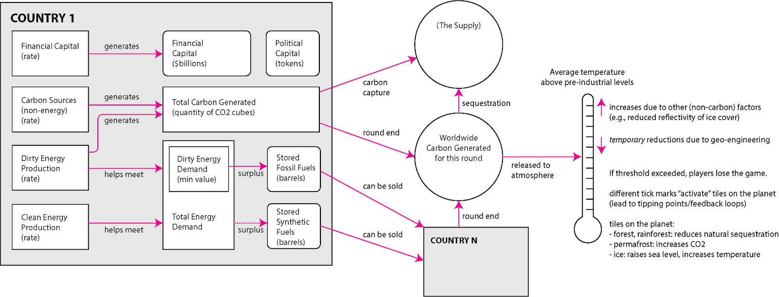
To get started, we needed to figure out what resources the players had and what attributes they’d need to track and how they affected each other. In order to guide the game’s design, we sketched out an early model to summarize this:
A sketch of the key resources and attributes of the game from 8 May 2020. Early versions of the game let players store, buy, and sell dirty energy and synthetic fuel from each other.
We sketched out the resources that players would need to track: financial capital, political power, dirty energy, clean energy, and carbon. Players would also need to track quite a few other attributes for themselves including their rates of income, how much energy and carbon they produced each round, their energy demand, and how quickly their energy demand and income grew.
Early Stats
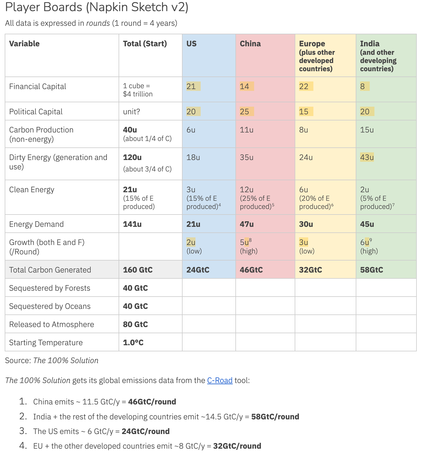
We didn’t want to over-engineer the first prototype of the game but also wanted the values involved to have some basis in reality. (Our initial aim was to get roughly within an order of magnitude.) We pulled some values from The 100% Solution (emissions and sequestration) and Wikipedia (financial capital was loosely based on GDP) to plug into the first prototype:
A “napkin sketch” from our design journal from 15 May 2020. We had big napkins. (All of these values have changed in the final game.)
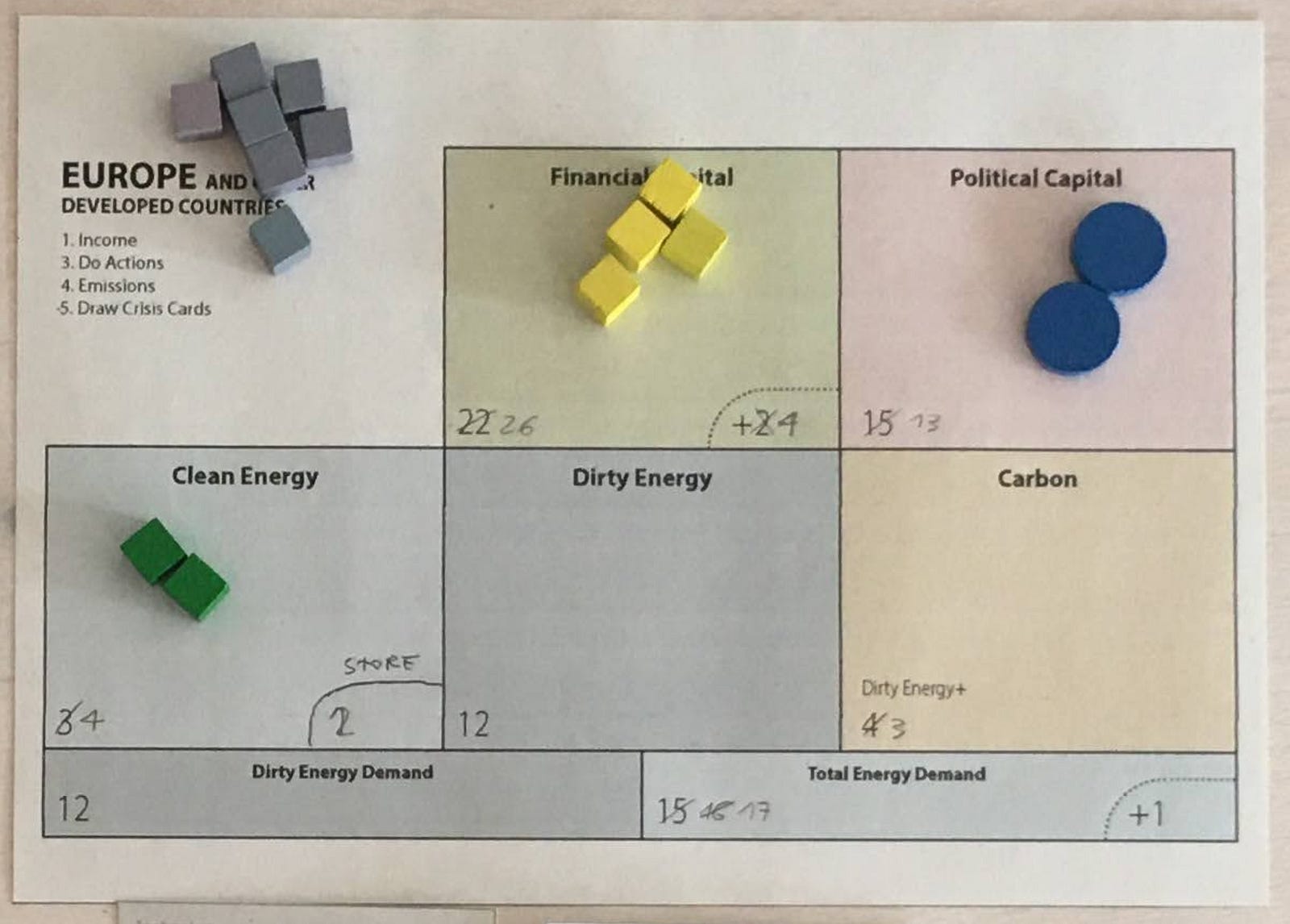
Our first player boards were set up to track all of this information. Here’s our very first player board:
If you’ve played Terraforming Mars, you’ll likely see the influence of that game. Each box on this board tracked both income (the number written down) as well as the player’s current balance (represented by the tokens).
We also tracked Financial Capital Growth and Total Energy Demand Growth and how much clean energy a player could save each round.
It was… a lot.
But, we were able to get a functioning game out of it! It was a bit long and fiddly, but was up and running.
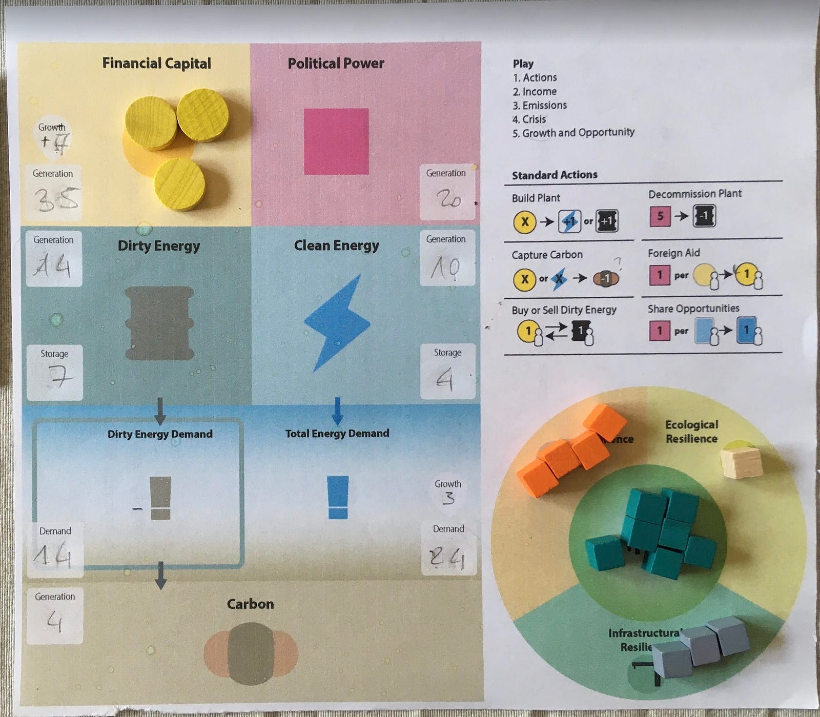
Our next version used a whiteboard arranged with the goal of making accounting a bit easier. Dirty energy cubes could be dragged downward from a supply box to meet demand, and then dragged downward again, to join the “other carbon” the player generated, in order to become the emissions generated for that round. We thought this was quite clever: the same tokens that were used for a resource could be converted into waste simply by dragging them across the board.
This design was also functional but complex. It was also hard for other players to read from across the table and not terribly accurate. The concept of “dirty energy demand” was hard to understand and a weird way to model the problem. And players had to handle a lot of tokens — they needed to collect and spend a good number of financial and political capital tokens each round, and the time needed to count and collect all of those tokens really added up.
Despite all of these issues, we used variations of this overall design from May 2020 to February 2021 while we iterated on other aspects of the game.
In February of 2021, we challenged ourselves to make the game “less about stats manipulation.” Overall play time was longer than we liked and a lot of game time was spent on bookkeeping — adjusting all the numbers and token counts on the player boards. One prompt that came up in a design discussion really intrigued us: what if we removed the financial capital and political power resources from the game entirely and instead used cards for the game’s currency? In hobby game terms, this was akin to transforming Terraforming Mars into Race for the Galaxy. A big change (which we’ll dive into in the next design diary).
Resources at a Glance
After we took that big leap, players no longer needed to track financial capital and political power. They still had to track energy and carbon however. I took a stab at how players might keep track of those resources with the aim of making their counts easier to read across the table. One experiment resulted in this physical sketch that used puzzle pieces:
An early experiment with a physical player board using puzzle pieces from 20 February 2021.
The pieces here represent dirty and clean energy plants (first row), dirty and clean energy demand (second row), “other” carbon (third row), and dirty energy storage (fourth row).
The dirty energy demand puzzle pieces could only fit into dirty energy plant tokens, which was meant to make it clear that the needs of legacy infrastructure could only be met by dirty energy sources (fossil fuels). I even experimented with making the clean plant tokens wider to communicate how they were more efficient. I thought this was all quite clever. In practice it was weird, fiddly, and confusing!
We didn’t have the ratios right at this point, either. Greenhouse gasses produced by sources other than electricity generation (transportation, industry, buildings, agriculture and land use, and so on) make up a much higher percentage of total emissions than we were initially playing with.
But one thing this design did get right was to break away from the whiteboards in order to “embody” the electricity plants and carbon sources on the table in a more physical way. We saw a lot of advantages to this: it was easier to track what other players were doing at a glance and calculations could be made by adding and subtracting pieces instead of writing and erasing numbers. It also promised to be a more sustainable solution since we wouldn’t have to include consumable pads of paper or use plastic whiteboard markers that would dry out.
After quickly abandoning the puzzle pieces, we tried a board with an extendable channel to hold the plant tokens next to a pegboard number line to track energy demand. The best feature of this design is that players wouldn’t need to do sums — they could simply physically rack up their plants to see if they met their demand.
This board let you quickly see at a glance if you were meeting your electricity demand.
This was the last design that featured the concept of “dirty energy demand.” We abandoned that concept after conversations with Justin Vickers of CMYK (who is an energy transition lawyer by day and a game publisher by night) and decided that players could simply generate 1 carbon cube per dirty plant each round provided they still had the plant on their player board. This was a better match for reality — any plants not shut down or mothballed (taken off of a player board) would continue to generate carbon.
Different Emissions Sources as “Resources”
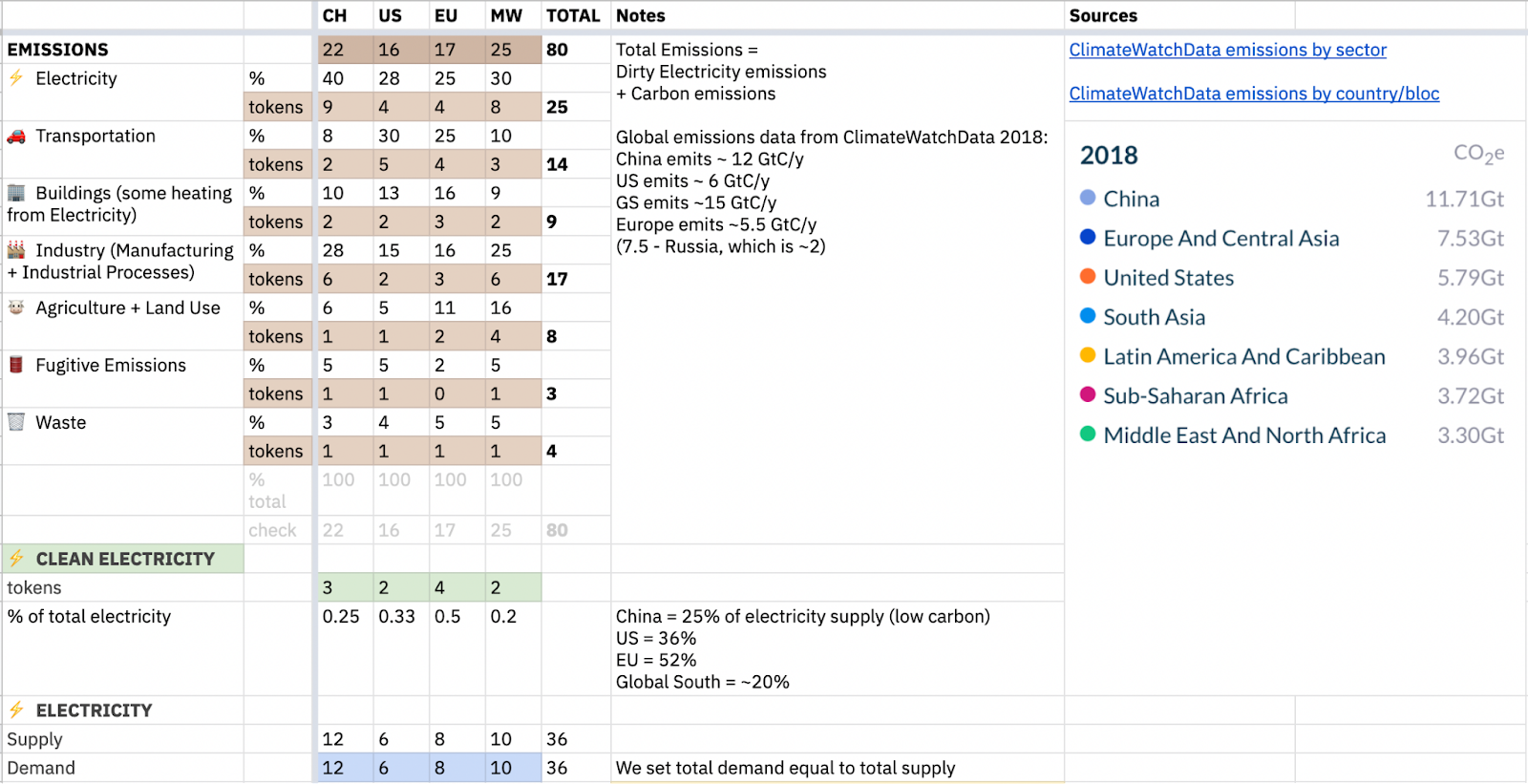
Then in March 2021, Matteo had the brilliant idea to further refine what we had been calling “other carbon” into the different categories of emissions sources that comprised it (Transportation, Industry, Agriculture and Land Use, Buildings, Fossil Fuel Extraction, and Waste). We updated the prototype to represent the proper amounts for those emissions using ClimateWatch “emissions by source” data.
(Here's the spreadsheet we used at the time.) This led to this design, which was a real breakthrough:
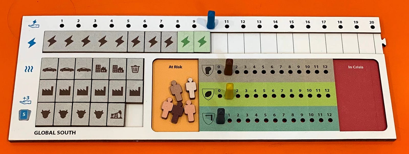
This board featured only one type of energy demand and introduced different emissions types. We also abandoned the concept of energy storage here given the scale and timeframes involved.*
ClimateWatch data in our spreadsheet helped us balance various emissions sources across the players.
The introduction of these new categories opened up a rich array of policies and technologies that could target those specific emissions. The game no longer only centered on shutting down fossil fuel plants anymore — it was much clearer that it was about decarbonizing your entire economy.
Fine Tuning
Once we had this design, we tried out a number of different arrangements so that we could quickly do emissions accounting, track resilience, and count the number of people or communities in crisis.
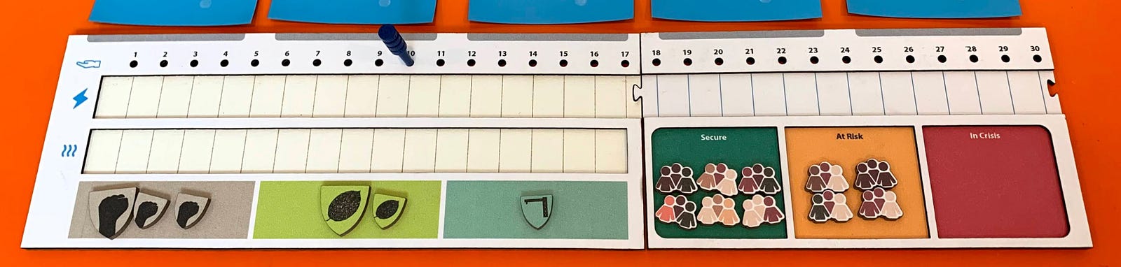
An experiment that used pegs to track resilience. We abandoned this approach since it communicated an arbitrary cap, felt more “mathy,” and was harder to read across the table.
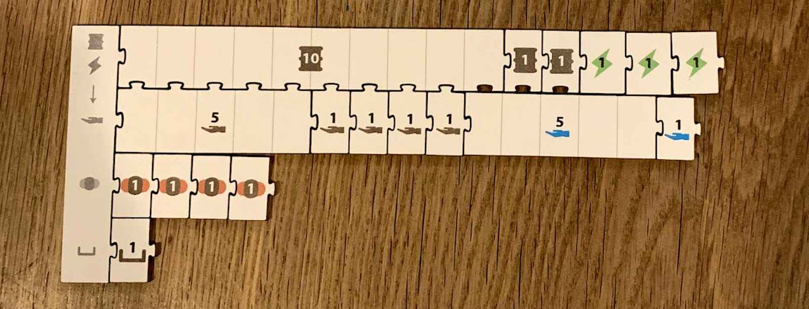
Emissions were easier to count in this design since they shared the same number line.
We simplified the Communities in Crisis area and added labels so players could more easily speak the language of the game (e.g., “social resilience” instead of “handshakes.”) This is the last version that we built for the prototype.
In the next post, we’ll look at how we designed the actions and opportunity cards that power the solutions in the game.
*Although we dropped the concept of storing energy from round-to-round, we do make an attempt to model how grid infrastructure is required to scale wind and solar due to the intermittency of those energy sources.