Experienced crowdfunding creators know that one of the keys to having a successful project is to bring your own crowd when you launch. This means that you need to have a group of people that already want to back your project that you can email right when the campaign starts. One of the most effective ways to get email sign-ups before your crowdfunding campaign launches is with a product landing page.
A landing page is a standalone website that is designed to fulfill a specific marketing goal. Typically, its purpose is to increase conversions by encouraging visitors to respond to a call-to-action. This might be clicking through to a shopping cart, or to generating leads by building email lists.
A landing page should be an integral part of a creator’s marketing strategy. For creators, a call-to-action could be to sign up to your campaign newsletter, a link to a pre-order store, and so on.
Ideally, a landing page should be up-and-running well before a crowdfunding campaign launch so it can promote brand awareness. If a form on your crowdfunding project’s landing page asks for email addresses — to sign-up to a newsletter, for instance — it can help creators expand their email lists for marketing and promotion. Your crowdfunding project’s pre-launch landing page also increases your crowdfunding campaign’s visibility, improving its ranking in paid searches. You may also choose to use a landing page to direct people to your Kickstarter pre-launch page (not to be confused with the Kickstarter preview link, which enables you to get feedback on your project and Kickstarter page design before launching).
There are plenty of customizable templates for landing pages. Sites like Wix, Unbounce, and Instapage offer a range of clean, simple designs.
Driving traffic to your crowdfunding project’s landing page
There’s no point building a landing page if no one sees it. Driving traffic to it is an important next step. Website-maker Wix advises sending the landing page as part of an email newsletter campaign, or adjusting search engine optimization (SEO) settings so it can be found on search engines like Google. Creators might also consider display remarketing, which retargets landing page visitors by showing them ads on Google and Facebook. Promoting your crowdfunding landing page as a link on your social media profiles and email signatures takes a matter of seconds and costs nothing.
Creators can choose to drive traffic organically or through paid advertising which means Facebook advertising for most crowdfunding creators. Kaitlyn Witman, director of product marketing at full-service digital marketing agency Rainfactory, says successful ad campaigns for her clients are typically built out in Facebook, which “is the most cost-effective in the pre-launch phase.”
“That’s the first touchpoint we measure — the cost per click on that top-of-funnel engagement,” Witman says. “Then when they get to the landing page, we measure the conversion rate optimization or CRO, on the lead generation page. That is in, the simplest terms, how likely a person is to sign up on that landing page.”
When implementing your ad promotion strategy, target your audience by age, gender, country, and interests. Making sure your crowdfunding project’s landing page is reaching the right demographic is crucial in achieving a high conversion rate. “Let’s say, for example, I have a widget that is appealing towards the older, female 45-55 demographic, and I’m only reaching males 24-34,” Witman says. “Then they’re much less likely to convert. The make-up of people accessing your site is going to impact how much they are going to get the product.”
Looks matter when designing a landing page for crowdfunding projects
The design and content of a crowdfunding project’s landing page is optimized to meet a specific end goal (buying a product, signing up for an email, and so on). It comprises the following elements:
- Headline: The title of your project or campaign is an ideal starting point. Make it simple but catchy.
- Tagline: A short description acts as a hook for your project. Don’t reveal too much detail here — the idea is to spark the imagination of viewers, who will then scroll down and hopefully engage with the rest of your content.
- Call-to-action: The call-to-action buttons should be easy to see and prominently placed on the page. While statistics suggest only 20 percent of page visitors read ‘below the fold’, this doesn’t necessarily mean the CTA button should always be placed ‘above the fold’. Over at Kissmetrics, it’s argued the fold is a myth, which underscores why you should always test and iterate your page elements. Also, don’t limit yourself to one button.
- Copy: Keep the copy polished and succinct. Less is more.
- Effective design: Establishing a strong visual hierarchy on your landing page will direct visitors where to look and, more crucially, where to click. The goal is to make the course of action clear and obvious to page visitors.
You’ll notice in the examples below that there’s little visual clutter and the copy is concise, conveying the message simply and clearly. Take a look at how the design and content work in concert to urge viewers to take action, and how there are multiple calls-to-action on each page.
The landing page promoting Tapeworm features straightforward copy, calling out the Kickstarter launch date and a brief description of the game. You’ll also notice the eye-catching imagery at the top of the page.
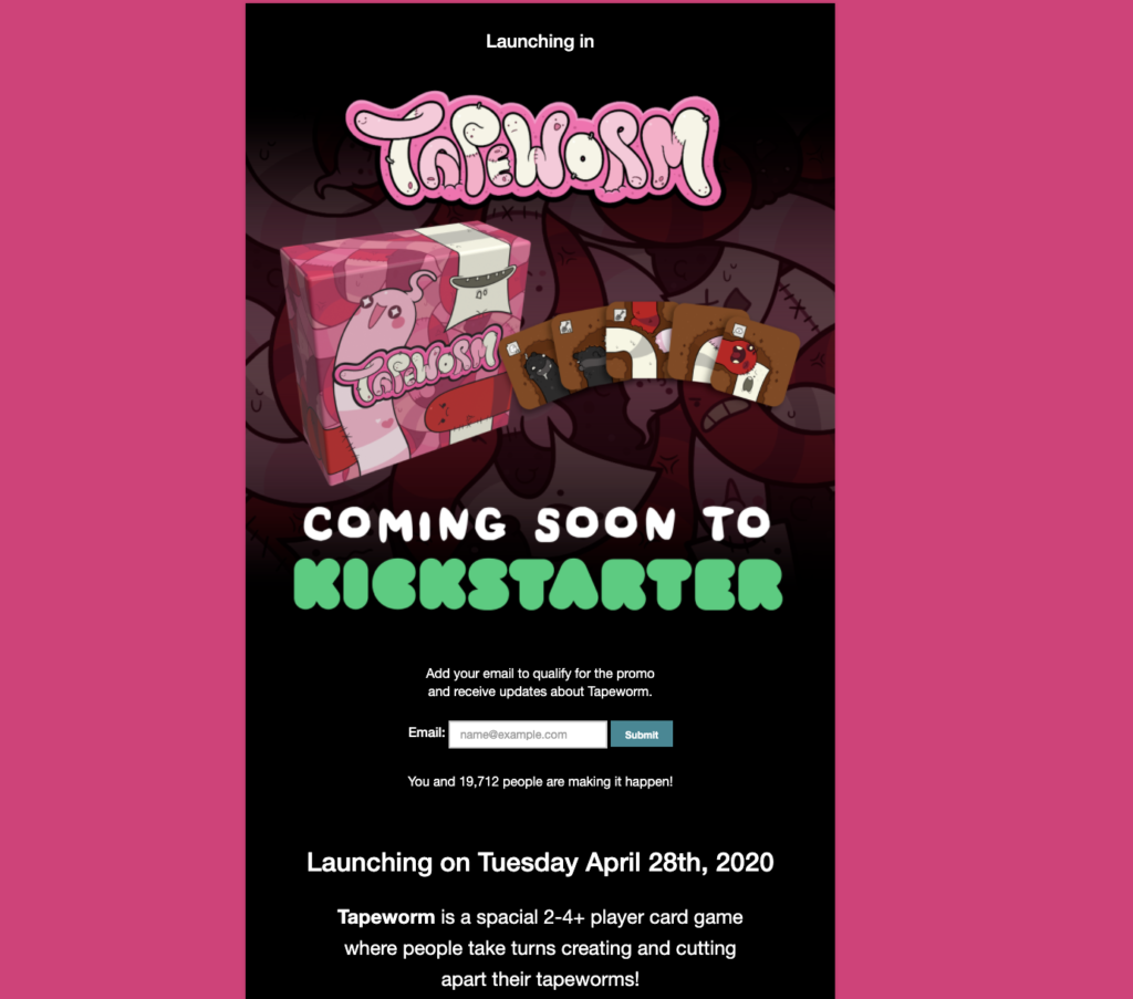
Scroll down a little more and you’ll see that a video announcing the new game has been included. While a video isn’t necessary, it can be an excellent attention grabber and way of explaining more about your project without having to put a wall of text up on the page that might turn off potential subscribers or backers.
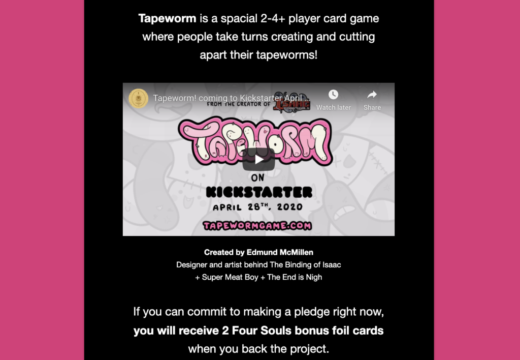
Another great feature of this page is that it doesn’t just collect email addresses, it incentivizes visitors to commit to pledging to the campaign: they will receive “2 Four Souls bonus foil cards” when they back the project.
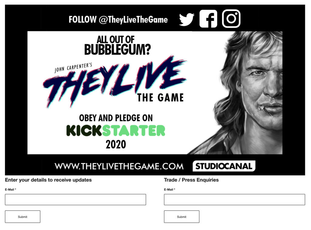
The landing page for They Live: Assault on Cable 54 was posted on the project’s Facebook page — a nice reminder to post a link to your landing page anywhere where you’re engaging with potential backers. The layout is fairly simple and the page links to various channels where visitors can keep up to date on the project’s latest developments.

EcoFlow’s landing page for the River mobile power station incorporates similar design principles. It has a ‘Join Waitlist’ button above the fold and as a sticky button as one scrolls down the page. It has three more opportunities for signing up (and includes a sign-up option on the footer of its FAQ, Contact, and About pages), which heightens opportunities for conversion.
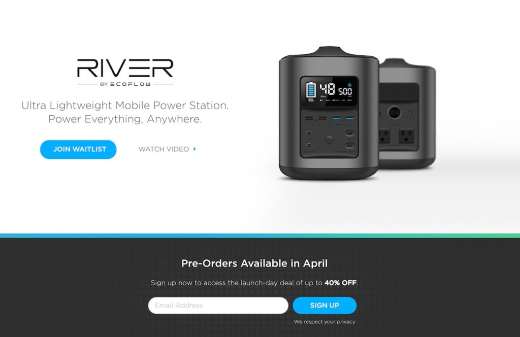
“If the lead signs up at the top of the page, that means they didn’t really engage with a lot of the content, so it’s maybe not as qualified as a lead,” Witman says. “If somebody signs up at the bottom of the page, that’s a really good indication that they’ve engaged with the content, and the lead itself is a lot more qualified.”
Building a list
According to a study by McKinsey & Company, email is 40 times more effective than Facebook and Twitter combined for customer acquisition. If you don’t have an email marketing strategy, it’s time to formulate one — fast.
Offering an appealing incentive can spur landing page visitors to sign up to your newsletter. These might include exclusive, members-only discounts; sample goods, a giveaway contest; and so on.
Kissmetrics offers a helpful guide to capturing emails without annoying landing page visitors. It suggests several options for introducing pop-up requests for email addresses. These include when users finish reading the content on your page; when users are about to leave the browser tab; or when a user scrolls down the page. A sticky bar that stays at the top of the screen while scrolling is another option that may prove less intrusive.
Email marketing services can be integrated with your landing pages. These generate email sign-up boxes (otherwise known as ‘opt-in forms’) that can be placed anywhere on your site. Having a few strategically placed opt-in forms are a sure-fire strategy. Most visitors won’t have looked at the entire landing page, and it makes sense to cover your bases and ensure there are as many opportunities for conversion as possible.
Take the opportunity to add a Facebook tracking pixel to your landing page. This will allow you to create Facebook ads targeting site visitors in the future. Google, Twitter, and retargeting services like Perfect Audience offer similar features.
Conversion rate optimization
It’s important to check that your landing page is optimized for success. You can do this by conducting an A/B test between two versions of your landing page to see which elements work and which don’t. If you’re using Adwords, Google Analytics allows users to test how different web pages perform using a random sample of your visitors.
For the best results, one variable should be tested at a time. This allows you to accurately determine which page elements are attracting the most traffic. Rainfactory’s Witman says high-quality photography and asset production are paramount in helping to drive conversion rates. “We’ve put pages with basic renderings or crude Photoshop assets and we’ve gotten decent conversion rates out of those because the demand was high,” she says. “But if it’s a middle-of-the-road product with mediocre image assets, the conversion rate is not going to be that great.”
Unbounce has a comprehensive list of page elements to test:
- Headline and/or product description
- CTA: this will test whether the text of your call-to-action is effective in generating clicks.
- Images or video on the landing page
- Button (text, design, color): changing the size and/or color of your button may yield surprising results. Testing the button text will be crucial in reaching your conversion goal.
- Form length
- Length of copy: test whether longer or shorter copy works best for your product.
Witman says crafting a successful landing page can involve many iterations before it achieves the benchmarks agreed upon between the marketing team and the client, and sometimes changes need to be made after the landing page is live to increase conversion rates.
“It depends on if we reach the target metrics that are agreed upon between the marketing team and the client,” she says. Usually, it’s a constant cycle of test and improve.
“Let’s say we end lead generation with a piece of copy that we really like — that’s what we generally lead with going into the campaign. But it has been the case that there may be some better performing ad unit that we launched during the campaign that outperforms everything that we did pre-launch, and we use those learnings and recycle them back into the other campaign assets.”
Launching the campaign
Read our guide — Pre-Launch Do’s and Dont’s — to learn everything you need to do to get ready for your crowdfunding campaign.