Your campaign page is the sales pitch for your crowdfunding campaign. Yet many don’t live up to their full potential: they’re unwieldy, distracting, or boring. Jamey Stegmaier says the biggest campaign page mistakes include too much text, bad design, and badly constructed reward tiers. These factors don’t create the best impression for backers.
Get to the Point
Project pages should deliver key points quickly and simply, rather than befuddle backers with unnecessary information. The best ones craft a compelling narrative. James Yu, BackerKit’s head of marketing, says a creator’s campaign page is an opportunity to highlight your project’s unique selling proposition. “Explain your product and what makes it unique in the first two sentences. Don’t start with a rambling story about how you came up with your idea. You start losing visitors the moment that they hit your page. Remember that you’re competing against Facebook, YouTube, Reddit, and the rest of the Internet for your reader’s attention.”
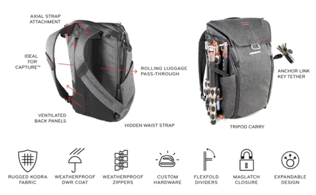
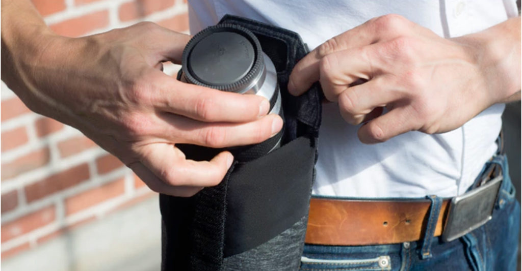
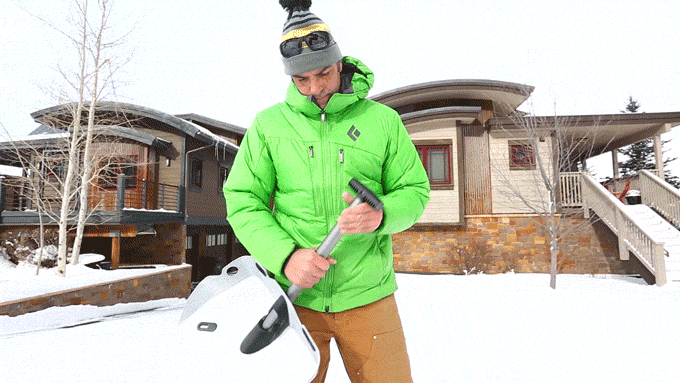
There are some practical measures you can take to avoid the TL;DR trap. Keep things short, simple, and scannable. Lengthy chunks of text can be made more digestible with formatting; consider breaking up text with subheads, bullet points, images, infographics, and animated GIFs (such as the one above from Peak Design’s Kickstarter campaign for the Everyday Backpack, Tote and Sling.)
“Nobody wants to read a gigantic wall of text,” Yu says. “When you edit your text for the first time, force yourself to remove 50 percent of the words. You’ll be amazed by how quickly you can find adjectives or entire sentences to delete when you give yourself a word count limit.”
Editing and re-editing the elements of your campaign page can take time, so make sure you’re not leaving it all until the last minute. On Kickstarter’s Campus forums, creators say the entire planning process — figuring out what copy to write and which images to include, writing a script and filming the video — can last anywhere between a day and several months. Jean Wu, creator of the Que Bottle says it took about a week for herself and her partner to put the page together. “It took a little more than a week to get all the graphics, video, and write all the words.”
Similarly, Redshift Sports’ Erik de Brun took a hands-on approach to the campaign page for the Shockstop. “We wear all the hats. We’re lucky enough to have an interest in graphic design, writing copy, and producing video. We feel there’s an authenticity in us putting those pages together ourselves. We spend a lot of time trying to get it right. ” He says creators can successfully outsource these duties to marketing agencies or freelancers, but the team “felt strongly about creating all the campaign material so that they were speaking with their own voice”.
Lights, Camera, Action
Kickstarter strongly encourages its creators to upload a video as part of their campaign page. It’s an integral marketing asset for any crowdfunding campaign, but making a video can seem scary for the camera-shy.
Your campaign video doesn’t need to be a work of art, but it should convey the purpose and intent of your project and what value it can bring to backers. It should be short: a running time of 1.5 to four minutes will satisfy those with the shortest of attention spans. For more guidance, check out Kickstarter’s guide to video best practices for tips, tricks, and advice.
Creators don’t necessarily need to invest in expensive, high-tech equipment to make a video. Here’s a checklist of items you’ll need:
- A smartphone or webcam: Obviously. If you’d like slicker production values, a camcorder is a safe bet.
- Someone to hold the camera: Rope in a friend with video skills or someone with steady hands, or consider hiring a videographer.
- A film-ready space: Present your product (and yourself) in the best possible light, literally and figuratively. An ideal film space should be clutter-free and visually appealing, and have plenty of natural light.
- Your product: Make sure it’s functioning and ready to go.
- A script: This is your chance to sell your product and promote its appeal to backers. A script will help you consolidate your talking points. Write it out, edit it, memorize it.
- You: It’s nice to see the human behind the project! Be genuine and boost your emotional connection with your backers.
“The importance of having a good Kickstarter video is that you can use the video as the asset for your page in terms of photos and GIFs,” Podo Labs‘ Eddie Lee says. “That way, you don’t have to do extra photography and you also have a unified look across the assets.” It’s as easy as grabbing a screencap of the relevant images and uploading them to your campaign page.
Say it with Images
Selecting high-quality, high-resolution images will make a campaign page shine. The more striking the image, the better: if you’re sharing your campaign page on social media, the image will often be the first thing your networks will see. If you’re not sure about sizes and accepted file types, Kickstarter offers its creators some technical specs. It recommends 1024×576 pixels (an aspect ratio of 16:9) for project images, and the file type should be JPEG, PNG, GIF, or BMP. Images may be no larger than 50 MB.
Yu recommends using images as a way to convey information simply and more memorably. “Identify areas where you can replace text with images,” he says. “Pictures are more interesting and keep readers engaged.”
Yu says creators can level up by using animated GIFs to demonstrate product features. “Moving images keep readers interested and are great at showing people what your product can do.” If you’re handy with Photoshop, making an animated GIF from a collection of images is a simple process; if not, there are plenty of online tools like GIFMaker or Makeagif that can make animations for you.
Keep in mind that having great images may also help you earn press coverage. Blogs need high-quality images to accompany their write-ups. Having high-resolution product shots will make it easier for the press to put together stories.
Highlight Press Coverage
Speaking of press, make sure to highlight any press coverage that you’re earned on the campaign page. If you have a tech project, then your audience will instantly recognize the Gizmodo, Mashable, and CNET logos and having those press mentions will add credibility to your project.
Having the funding amount, and backer count metrics on display turns the campaign into a movement that gains speed as you add more backers and external validation from the press.
Take a look at how the Evie Blender’s Indiegogo campaign collates its press coverage on its site.
Be Creative with Your Content
Yichuan Wang, one of the creators behind tabletop horror game Deep Madness, believes that following an editorial calendar helps to maintain regular communications with backers.
Wang says his marketing strategy focused on ensuring each post (whether on on social media, the campaign page, or on the creator’s website) had a clearly defined purpose and was published in a timely fashion.
“Each of our posts is carefully prepared. Attractive content is more likely to seize the attention of users,” Wang says. Rather than flood backers with promotional material, Wang advocates a more considered approach. “We regularly released a little bit of content each time — like a few photos of models, or an illustration.”
In addition, Wang says that an injection of creativity or personality can make traditional updates more compelling for backers. “A highlight of our campaign was our team of professional writers,” he says. “In our updates we abandoned the traditional informational messages, and instead wrote a lot of exciting content about the world in each post. Each update was a bit like a short story or a small slice from a novel. That was a lot of fun for us, and our backers seemed to really enjoy that, too.”
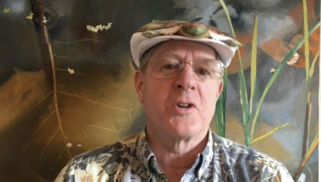
Lynn Johnson, the creator of the Turtle Hat, adopted a quirky, idiosyncratic approach to storytelling on his campaign page. Johnson’s lack of fancy graphics is more than made up for with his sense of humor. The simplicity of Johnson’s story allows backers to see the person behind the project, and his project’s tagline — “You cannot take yourself too seriously with a turtle on your head” — neatly encapsulates what makes his project so unique. It’s authentic, creative — and it paid off.
Keep it Fresh
A crowdfunding campaign page is often a work in progress. Podo Labs’ Eddie Lee says campaign pages can always be improved throughout the campaign. Sometimes more copy or different information would be added, or a total refresh of the page’s elements would be in order. “We tended to keep revising it,” he says. “In the first two weeks, there’s not much press about the product, people don’t know what it is,” Lee says. Potential backers are in “complete exploration mode”, so the page is tailored to that experience. As the reviews and influencer testimonials come in, you can add them to the page to add more social proof.
In the final two weeks of the campaign, he says, visitors are more likely to be acquainted with your product. “Maybe they’ve come to the page before and they haven’t decided whether to back the campaign, or they’ve read everything about it in the press article,” Lee says. “So you can do different things in the final two weeks, such as move the rewards higher up on the page above the description, so they start seeing prices and options faster.”
In the final week of Podo Labs’ campaign for the Jack, his team did a total redesign for the Kickstarter campaign page. “When you see the comments and questions on the page, you get a sense of what people didn’t understand, as well as what mattered to them the most,” Lee says. Initially there was confusion over how the product worked.
“We had some diagrams that we thought explained exactly what it did, but people would still ask: ‘How does this work’?” In response, the team went back to the drawing board, redesigning the diagrams and experimenting with how to display instructions. As a result, Lee says, “we re-prioritized and made things more clear”. And even if things look pretty good, Lee warns against complacency. “The color or font selection could always be more perfect”.