
Updated September 19, 2024
Experienced crowdfunding creators know that one of the keys to running a successful campaign is to bring your own crowd when you launch. This means that you need to have a group of people who want to back your project that you can email and mobilize when the campaign starts. One of the most effective ways to get email sign-ups before your BackerKit, Kickstarter, or Indiegogo campaign launches is with a teaser page.
What is a teaser page?
A teaser page — also sometimes referred to as a landing page — is a standalone web page that is designed to fulfill a specific marketing goal, such as collecting email sign-ups. It can increase conversions by presenting content that is highly-focused, limiting distractions, and featuring a clear call-to-action that encourages visitors to take the desired action.
For crowdfunding creators, a teaser page should be an integral part of a campaign’s marketing strategy. Prior to launch, your teaser page’s call-to-action should be focused on driving email sign-ups.
Getting started
When you’re ready to start designing your page, you’ll find that there are a lot of different page builders out there. For crowdfunding campaigns, BackerKit Launch is an excellent option. Launch is an email marketing and analytics tool specifically designed for crowdfunding creators. Not only does it allow you to instantly generate and then customize a teaser page to collect emails, but you can also use it to test the strength of your email list to see which contacts have pledged to crowdfunding campaigns in the past, and are therefore more likely to back you.
Ideally, a teaser page should be up and running well before a crowdfunding campaign launch to provide you with enough time to build an engaged audience. To make sure you have the strongest email list possible before your project goes live, you can sign up for Launch six months before launching to start collecting leads well in advance.
Looks matter when designing a crowdfunding project’s teaser page
The design and content of a crowdfunding project’s teaser page should be optimized to drive email sign-ups. The page should feature the following elements:
- Headline: The title of your project or campaign is an ideal starting point. You can add a short description. Make it simple and short.
- Hero image: The large, featured image at the top of the page should immediately grab visitors’ attention. This is how you welcome potential backers to your page and introduce them to your project. Depending on your project, this may be a high-quality photo or an illustration.
- Subhead: A short description acts as a hook for your project. Don’t reveal too much detail here — the idea is to spark the imagination of viewers, who will then scroll down and hopefully engage with the rest of your content.
- Call-to-action: The call-to-action buttons should be easy to see and prominently placed on the page. While statistics suggest only 20 percent of page visitors read ‘below the fold’, this doesn’t necessarily mean the CTA button should always be placed ‘above the fold’. It’s argued the fold is a myth, which underscores why you should always test and iterate your page elements. Also, don’t limit yourself to one button.
- Body copy: Keep the copy polished and succinct. Less is more.
- Effective design: Establishing a strong visual hierarchy on your teaser page will direct visitors where to look and, more crucially, where to click. The goal is to make the course of action clear and obvious to page visitors.
You’ll notice in the examples below that there’s little visual clutter and the copy is concise, conveying the message simply and clearly. Take a look at how the design and content work in concert to urge viewers to take action.
Crowdfunding teaser page examples
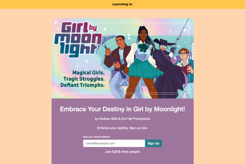
This teaser page for Girl by Moonlight has a strong image, and the words displayed on the graphic are clear and legible. The creators also utilize a pair of dynamic headlines and subheads: “Embrace your destiny” and “Magical girls. Tragic struggles. Defiant triumphs.”
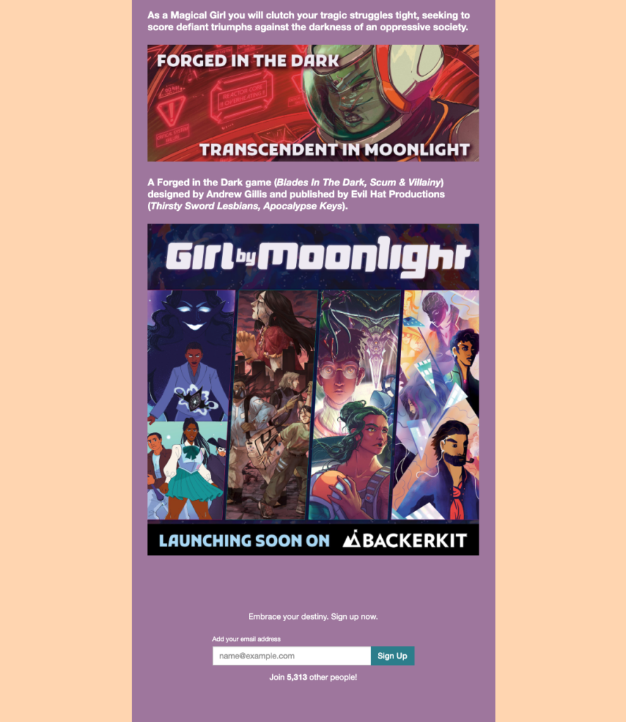
The rest of the copy on the page is concise, describing the game’s story and background in just a few sentences. You’ll also notice that the copy is broken up by images, making it easier to read than if it were a huge block of text.
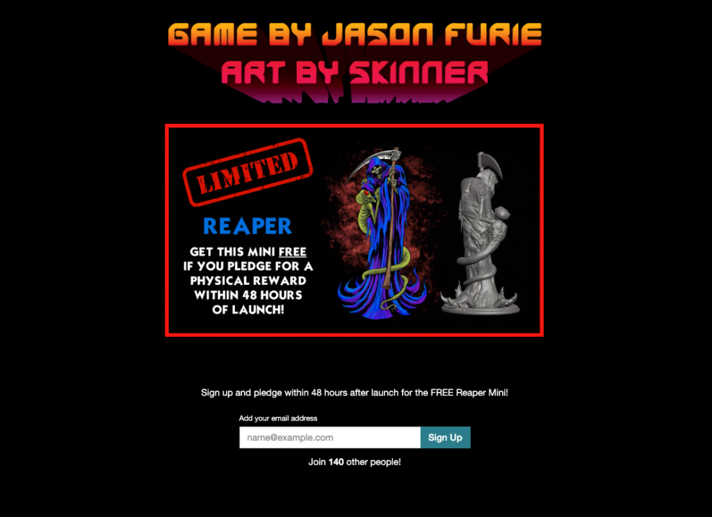
The teaser page for Realm Runners features an attention-grabbing header image and minimal copy. It also incentivizes sign-ups and early pledges by offering a “free reaper mini.” Offering an appealing incentive can spur teaser page visitors to sign up for your email list. These might include exclusive, members-only discounts, sample goods, or a giveaway contest.
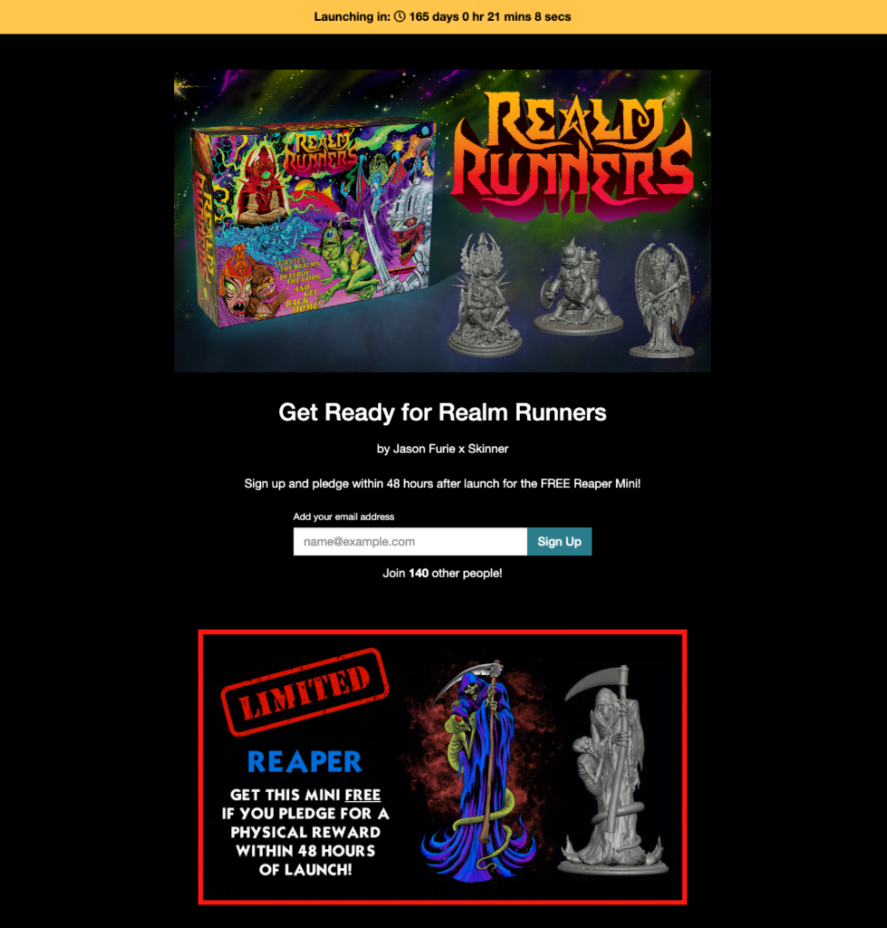
When you scroll down the page, you’ll notice that the incentive is repeated above the second email form field. This gives visitors who perhaps needed to read a little more about the project to commit to signing up a second opportunity to join the email list.
It’s testing time
It’s important to check that your teaser page is optimized for success. You can do this by conducting an A/B test between two versions of your teaser page to see which elements work and which don’t. If you’re using Adwords, Google Analytics allows users to test how different web pages perform using a random sample of your visitors.
For the best results, one variable should be tested at a time. This allows you to accurately determine which page elements are attracting the most traffic. Rainfactory’s Kaitlyn Witman says high-quality photography and asset production are paramount in helping to drive conversion rates. “We’ve put pages with basic renderings or crude Photoshop assets and we’ve gotten decent conversion rates out of those because the demand was high,” she says. “But if it’s a middle-of-the-road product with mediocre image assets, the conversion rate is not going to be that great.”
Page elements to test:
- Headline and/or product description
- CTA: this will test whether the text of your call-to-action is effective in generating clicks.
- Images or video on the teaser page
- Button (text, design, color): changing the size and/or color of your button may yield surprising results. Testing the button text will be crucial in reaching your conversion goal.
- Form length
- Length of copy: test whether longer or shorter copy works best for your product.
Crafting a successful teaser page can involve many iterations before it achieves the agreed upon benchmarks, and sometimes changes need to be made after the teaser page is live to increase conversion rates.
“It depends on if we reach the target metrics that are agreed upon between the marketing team and the client,” Witman says. Usually, it’s a constant cycle of test and improve.
“Let’s say we end lead generation with a piece of copy that we really like — that’s what we generally lead with going into the campaign. But it has been the case that there may be some better-performing ad unit that we launched during the campaign that outperforms everything that we did pre-launch, and we use those learnings and recycle them back into the other campaign assets.”
Getting ready to launch a crowdfunding project? Create a teaser page for your project, so you can start building your email list today with BackerKit Launch. 
Editor’s Note: This blog post was originally published in 2017. It has been updated for relevance and accuracy.